Following the last post on Italian house Etro, here is some pictorial analysis of my fascination.
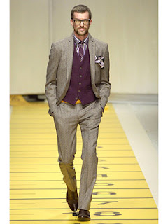
As much as Etro’s originality and quality can inspire, it is often the catwalk combinations that galvanise me. Take the first image on the left – a pale grey suit with purple waistcoat and coordinating tie, shirt, handkerchief. Now, as a whole this is too much. Some people might be able to get away with it – perhaps Italian eccentrics who happen to be heir to an automobile fortune. I can’t.
But like much that is thrown down the runway, it is not supposed to be copied. It is supposed to inspire. I have a sweater in a dark purple from Reiss. Up till now I have only worn it with navy suits or jackets. Perhaps I will try it with a pale grey – even brown, which this suit seems to tend towards.
Equally, I would have thought the colour too dark to be worn with brown shoes; yet it works well here. And the twist of the yellow belt: perhaps too much, but it does remind me of the contrasting colours (one primary colour’s contrast is the mix of the other two – so, yellow’s is purple).
The handkerchief is too showy and I don’t like the pattern. I don’t particularly like the tie or shirt either, certainly not together. But a similar suit tone with a purple sweater, perhaps over a blue-and-white striped shirt? That could work. And yellow would be good as an accent, in a handkerchief or even a belt as here.
The image and its colours inspire in a way that is rare in menswear.
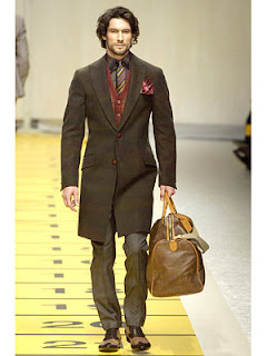
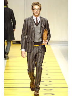
The second image on the left points out how well rusty reds work with brown, though I’d never go for that tie or shirt. The third is all about combinations of pattern. The suit, sweater, shirt, tie and handkerchief all have different patterns. But they work because the wide stripes of the sweater (and its strong outline) separate the suit and shirt/tie. Equally, the tie and shirt are a similar enough density of pattern to fit well together and to slip into the background. The colours (except for that yellow belt again) are not that extraordinary, but the patterns take it to another level. I wouldn’t wear it all, but it inspires.
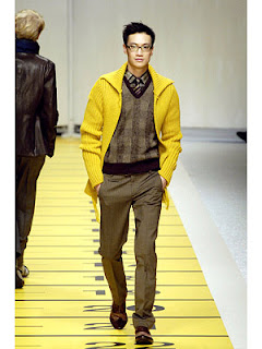
The next image shows how well bright colours can go together if they are balanced (either the tie or the trousers on their own would stand out too much). The penultimate combination demonstrates balancing the strong pattern of a suit with plain, background colours elsewhere. And the yellow sweater in image number six just seems to work. Perhaps it’s the implied yellow in the green-tinge trousers and vest, I’m not sure.
During this same season, Fall 2007, Calvin Klein was displaying grey tonic suits, with the occasional bright yellow. Armani had quilted vests and collarless shirts, but was basically black and blue. Both seem not only dull but unsophisticated compared to the density of colour at an Etro show.
Have a flick through the previous few years’ Fall collections at Etro. Try and ignore 2007’s floppy yellow hat. The rest might just inspire you.
Related posts
Subscribe
Connect with
I allow to create an account
When you login first time using a Social Login button, we collect your account public profile information shared by Social Login provider, based on your privacy settings. We also get your email address to automatically create an account for you in our website. Once your account is created, you'll be logged-in to this account.
DisagreeAgree
0 Comments
Inline Feedbacks
View all comments
I have to say, that's pretty much the opposite of everything I love about the Rifugio one. It's so showy and overdetailed. Much better with the nubuck finish, and it's all about the skin
Rifugio’s old villa
Read the commentsThank you
Introducing: The PS Shorts
Read the commentsI'd suggest Rubato, Orslow, Blackhorse Lane
What makes quality jeans – and should you care?
Read the commentsA lightweight raincoat essentially. Probably a synthetic - my Coherence one does that pretty well
The olive PS Trench is back
Read the comments
