Best lookbook 2019: Drake’s (or, what is heritage summer?)
Best lookbook: Drake's
Runners-up: Stoffa, Saman Amel
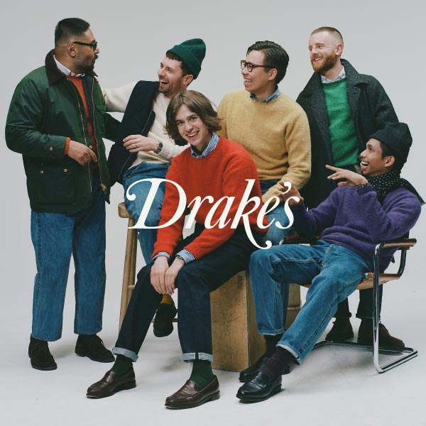
This was our first award on lookbooks, and I think it raised some interesting questions about how brands present themselves in their imagery.
Certainly that was what I ended up talking about with Michael Hill, creative director of Drake’s, when I discussed their win with him last week.
Drake’s has always been known for its photography, and for its strong sense of style, but that happened largely by chance. It’s evolved as the company has grown - which was perhaps the most interesting area of discussion.
Oh, and for those that are interested in the direction of Drake’s Spring/Summer 2019, don’t miss the questions at the end.
Permanent Style: Do you use the terms lookbook or campaign internally today? What do they mean to you?
It’s a really good question to be honest, really good, because although we call what we produce lookbooks, I’m not sure they really are. Certainly what we did initially wasn’t deliberately like that.
When Drake’s started developing, we wanted to put imagery out there. We had a particular view of how the clothes could be worn, and we wanted to communicate it (although it wasn’t meant to be prescriptive).
So doing a lookbook made sense. And every season, one of the guys in the team would say ‘what are we doing for our lookbook, we should do one’. But I wasn’t sure that was what we wanted to do - we just wanted to produce good imagery. I didn’t see it as a lookbook.
Was that because you weren’t using a lookbook in the traditional way a bigger brand would - as a set of looks that magazines call in clothing from, for their shoots?
Yes, exactly. And we certainly weren’t doing campaigns either - because we were too small for that.
Campaigns as in - sorry, just to define the terms for readers - photography that would be used in advertising, again in mainstream magazines?
Exactly. We weren’t doing either of those things - we weren’t that PR-savvy to be honest, and I felt calling it a lookbook would be to make it seem bigger than it was. But we still wanted to create good imagery, to get our ideas across.
Today that seems completely natural, because it’s what everyone does on social media. But back then social media was tiny.
Looking back on that period today, I probably way overthought it, and it didn’t matter whether it was called a lookbook or not.
But really what I wanted to do was have more running content throughout the year, not just a seasonal statement like a designer brand. I wanted to change the imagery with the seasons and with the weather.
The natural limit on that of course is that you can’t afford to go in the studio every week, or travel to a location. But as so much photography is now done outside of those settings, today we can do that, and use new ideas constantly.
When you did start to travel for shoots, how did you pick where you were going? Was it around a certain vision for the collection?
I wish. No, it was very much driven by places and people we knew.
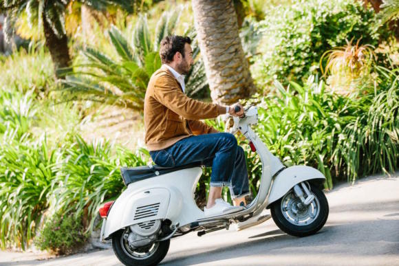
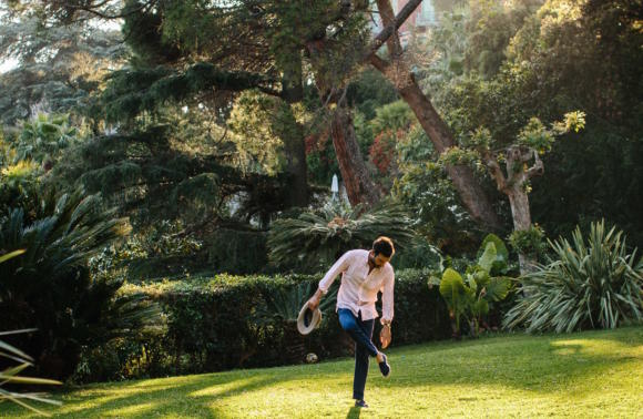
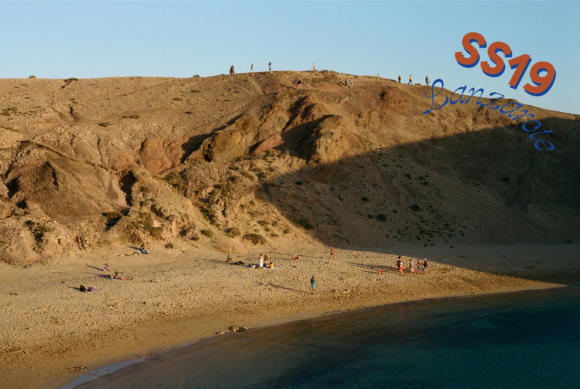
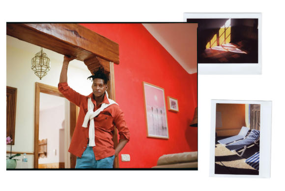
So for example, the current lookbook was shot last month in Lanzarote. Now we’ve been talking about that for years, because Juan [Rivero Bosch] who used to work with us, is from there. He knew a few locations, and could be very helpful, so there was that personal connection.
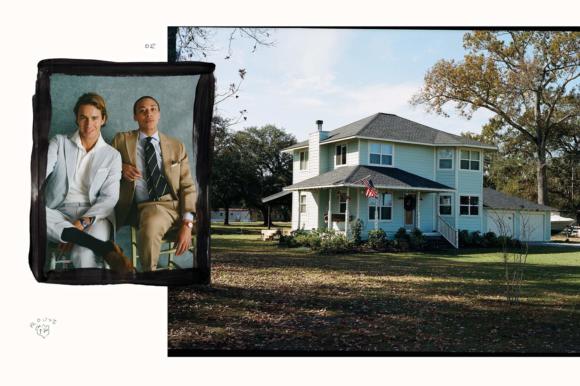
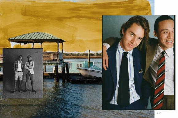
Then a few years ago we did a shoot in Genova, around Liguria in Italy, with Jamie [Ferguson] shooting Adam Rogers [above and below]. That came about because another colleague of mine, Francesca, was from there and could make loads of other good suggestions.
In fact, we were working a little with Adam at the time, but he hadn’t really modelled before. I just asked him if he fancied it, it would be a fun few days.
He was great, really comfortable in front of the camera.
You’ve used professional models more in recent years - why is that?
It’s a funny one. In a way I’d like not to use models, because it often feels more personal and natural when you don’t.
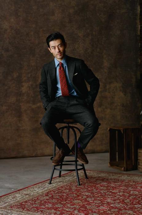
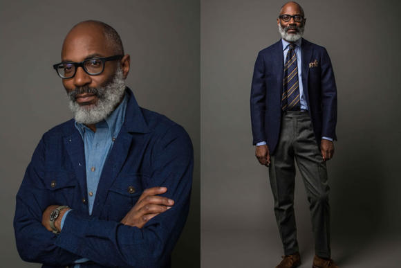
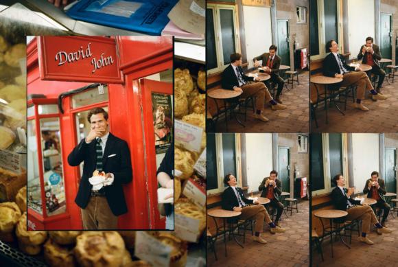
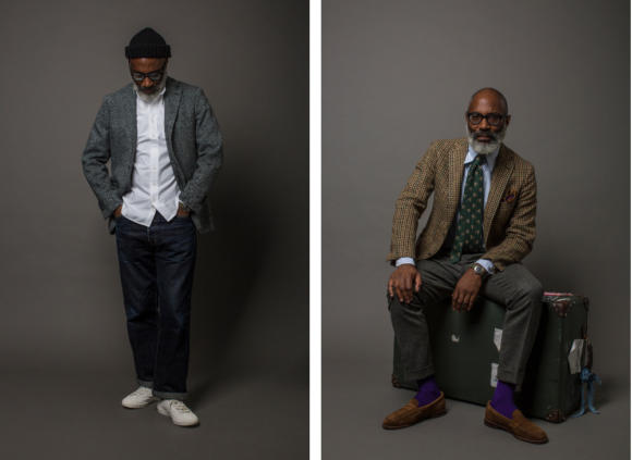
When we started working with Jason Jules [below] it was great - he was a customer and a friend, and it worked very well. Before Jason we used a guy called Max who worked in the cafe next to us on Haberdasher Street, where we had breakfast every morning.
As we’ve evolved, we’re just more likely to have tight timelines or schedules, and it makes life easier to have a model that fits the clothes, that knows how to move. It means more predictability.
How much do you think about the lookbooks in advance?
It’s really lovely to win this award, it means the world. But to be honest, it’s not the focus - we’re a manufacturer, and the product is the focus. Marketing and photography just folds around it. I’d never want a situation where the lookbook was great, but the product wasn’t quite right.
Marketing is what you do Simon, the great things you’ve done for the industry since you’ve been involved. And social media, that gives us this great new way to connect with customers. But it can never come first.
I’ve often felt like a better way to describe the companies we cover is not ‘classic’ or ‘heritage’ but product-focused. You go into the Drake’s store, everyone can tell you about the product. That doesn’t happen in a designer store.
I think that’s a nice way to put it. The product must come before everything else.
Also, I think what it means in the lookbooks and other imagery is that we want it to be relaxed - to not look as if we’re taking ourselves too seriously. It’s not over-styled, like a campaign might be. It should feel very natural.
That must be a hard thing to get across, given you take the product so seriously.
Yes it is, and I’m often the one that’s fiddling with pieces on a shoot, that’s asking whether we got this detail or that detail. But everyone reminds me that the overall atmosphere is important - that we want to suggest ways to wear the clothes, but that it should feel fun.
How do you put together the looks, then and now?
[Drake’s co-founder] Michael Drake always used to emphasise to us how important the overall look was - even when we were just making ties and scarves. He used to always say that a beautiful tie doesn’t exist on its own, it needs to work with something.
So that was important from the beginning, and I think we were driven very much by Michael’s style. He was a well-dressed guy, and we took inspiration from his tweed jackets, flannel trousers, socks and shoes.
I’m not saying Jason Jules looks like Michael Drake - his style was always a little different - but that was the inspiration at the start. And then over time I put my own spin on it too.
A lot of the styling was quite random though. We’re a bit more organised these days, but back then we would just get all the clothes into the studio and start playing around with things. It was fun and creative.
Of course, there was the risk now and again that you’d break a rule or two - something that’s always a danger in this classic menswear world.
But I think we did some new things that way too. Jason would take something from the rack and say ‘how about this’ and we would be sceptical, but actually it would really work.
I guess that will be a relief - and perhaps good advice - for readers. Because they spend every morning getting dressed, or putting looks together. It could encourage them to play around a bit more.
Absolutely. I often say to Matt [Coles, head of marketing] that we should go back and look through those old looks, that we might want to cut some out that we don’t like any more.
But I think we might be surprised actually - that there will be the same mix of classic and fresh that we aim for today.
We were perhaps a little more naive back then, but the impetus was the same.
In recent years James Harvey-Kelly has done all the lookbooks, and much of the social media too. Was that a conscious decision to have a more consistent look?
I’d always wanted to work with James. We’d known each other since we were 18 and getting into the business - well, James was 18, I was a bit older. And we always said we’d work together, but it never happened.
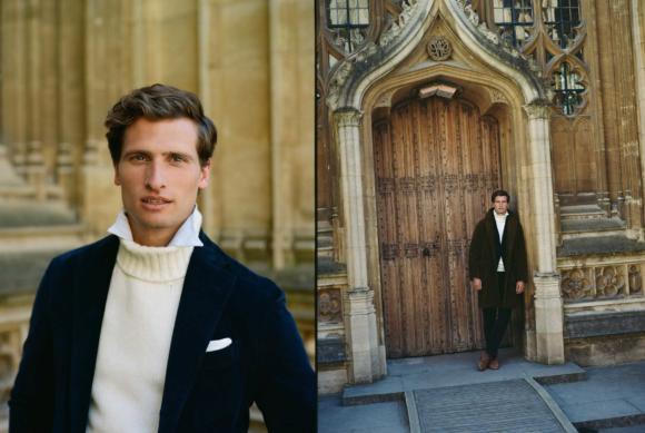
When it finally did, I think it was good to have that consistent vision, yes. We had great imagery before, but James and I have a very similar philosophy about British style, and about how Drake’s fits into it.
James also seems to use more atmospheric shots, about the location and the local culture, rather than just the models. Was that his idea?
It happened rather by chance. The fact is we usually can’t afford to do a Spring/Summer lookbook outside of the studio - it’s just not as big for us as Autumn/Winter. So we couldn't afford to travel to the US.
But James said, I can get a flight out there for £350, I’ll stay in a caravan - I reckon I can do the whole thing for £600. And then he wanted to layer the imagery with the studio shots - to help set the tone.
I think it worked well, and we had worked out in Charleston several times over the years, so it was definitely one of our locations.
Then this year, it helped make the transition to doing a full shoot in Lanzarote - the first time we’ve done one for Spring/Summer.
On the subject of this Spring/Summer collection and that shoot, I think it’s fair to say it’s different to what we’re used to from Drake’s - with more logos, more casual pieces. How would you describe the direction?
Well, I think it will come out more in the coming seasons, but it’s about finding an English heritage look with always that connection to the product.
So for example I was reviewing a piece this morning which we’re calling our hiking shirt, and it’s made with this lovely Japanese loopback cloth, in a great cut-and-sew factory in Japan. That’s always key - we never want to lose that connection to great mills, great makers.
A lot of the categories we’re adding now, we wanted to do from the start, but didn’t have the time, didn’t have the money. So everything’s building up slowly, and will carry on doing so in the coming years.
I guess we’re more used to craft stories around Autumn/Winter pieces, like tweed coats or leather boots. It’s a little harder with Spring/Summer.
Yes I think that’s right, although actually making the outerwear for this season was the most technical development work we’ve done, in terms of garment manufacture. The material might not be hand-loomed in the Hebrides, but there’s so much going on in there.
Also, from a style point of view not many people are doing this in terms of British heritage. You can get a wonderful piece from Loro Piana or Hermes, but it’s - in my view, as an outsider - often quite technical, or shiny and modern.
We’re more likely to go back, to research the old British cloths, such as an amazing heavy cotton drill. Ventile rather than Storm System, or waxed cotton from Dundee.
Others do that well too of course - Mackintosh, Private White - but I think we can do it in a way which is really special and unique to us.
It sounds like there’s a great story to tell there. I look forward to hearing it over the next few months.
Well thanks for giving us the opportunity to start today - and thank you again to all Permanent Style readers for the award.














Whilst Drakes make great individual pieces when I’ve seen the ‘poll’s it always struck me as though it ages the wearer.
Take for example the tweed jacket …..absolutely beautiful and so rich in colour and texture …. But then they stick it on a twenty something with a pair of cords and a tie and he looks like a child from the royal household .
But great quality clothing and ties
If only the younger members of the royal household dressed that well…
Perhaps classic menswear in general look better on men who have left the adolescent or youthful stage. A lot of men in their early to mid twenties have a youthful look. Facial hair helps if they have the genes.
It’s the same reason I have a hard time seeing myself in turtleneck tailoring (turning 30 this year). My meager facial hair can’t compensate enough.
I agree. It looks fantastic on older men, but makes those in their twenties look anachronistic, or like off-duty school prefects: the ‘costume trap’ appears to be exaggerated with younger men, perhaps because the level of formality is so far above atheleisure wear. However, if a twenty-something were to work at a place where a jacket and tie were mandatory, then Drakes would be great.
All the more excited about my fav classic menswear brand after reading this. Great interview Simon, thanks.
Half my wardrobe is Drake’s, and it’s such joyful, life-affirming stuff. Plus the service is knowledgeable and personal as Simon points out.
Drake’s, may you prosper and keep me happy and well-dressed for many many years. Cheers!
I think the fall/winter lookbooks from Drakes have been exceptionally great for many years. But for some reason I have difficulties to like the spring/summer looks. Maybe the things that Drakes does best (other than ties) like shawl collar cardigans and tweed are more for the fall/winter-season.
Well done to Drake’s. The lookbooks are an effective means to provide a feel for combining styles, patterns and fabrics , without (as Michael said), being prescriptive. I particularly liked some of the older ones with Jason. One thought though, whilst I tend to look past the age of the models, perhaps the occasional more mature model, as there are older men out there (like myself), who may then identify more with. the products. It’s a small point though as I don’t know the target demographic. All in all Drake’s sell some great products at a reasonable price and what more can you ask for?
This is definitely a fascinating study in permanent style readership. It’s great to see, through the interview above, that the Drake’s lookbook appears so different from others because the market for the actual artifact is different. As someone who has never worked in retail, I had no idea what the value chain was for promoting various seasonal items.
I have often found myself in lust with many of the items from Drake’s seasonal collections, but the lookbooks actually go far to reduce my interest. I’ve always attributed this to the strange way the clothes are portrayed but having the insight of this interview available, it seems that maybe I am just used to clothes being presented one way and Drake’s took a decidedly unfamiliar path.
I do think the SS19 lookbook goes off a cliff in terms of presentation, however. It seems to have taken the late-oughts Ralph Lauren approach to presentation by putting pieces of fine menswear on a preppy teenager traipsing through the dirt. On the surface it doesn’t seem any less realistic than the Cesare Attolini or Loro Piana approach to using their lookbooks to try and convince you their tailored wear will turn you into a gallivanting Italian gentleman, but there is something off-putting about the Drake’s and old Ralph Lauren approach to presentation.
Though I don’t think this is an indictment of Drake’s so much as it simply reflects the differences in what I’m used to versus the path they have taken and what the majority of permanent style readership clearly appreciates.
All I can think of when I look at the latest A/W pictures is how uncomfortable it must have been throwing on all that heavy clothing on what must have been one of the warmest days of summer. Makes me sweat just thinking about it.
Interesting to see terms like “British style” and “British heritage” appearing above given that the last couple of seasons seem to have been so heavily influenced by American the Ivy League look. Indeed, the latest look-book resembles a Ralph Lauren catalogue.
This, combined with the fact that each new season is also now accompanied by an inflation-busting price-hike, has seriously put a dent in my interest in Drake’s offerings over the last year or two.
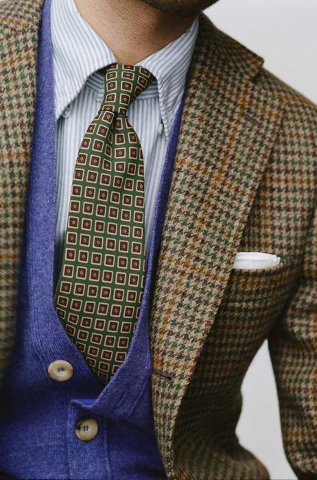
Does anybody know where that houndstooth jacket in the final image is from? (or indeed something similar that uses a green overcheck like this)
I had a look on Drake’s website but couldn’t find it anywhere.
It’s from an old season Tom, but I believe Drake’s have several similar ones in their MTM programme. It’s a gun-club check.
I’ll partly chime in with a few other readers here, ironically I think this years SS lookbook especially, is the weakest one in a long time. I think it’s more down to the clothes than the photography and setting though, even though that also plays a part.
I always loved the one with Adam Rogers and some older gentlemen in Italy. Compared to that one the SS19 looks a lot more contrived. It’s hard to pinpoint exactly why, but I think the use of “real people” rather than models makes it more approachable, along with the a bit more monochrome styling which also plays a big part. If I recall correctly, the colors used for the Adam Rogers one were a lot more subdued, lots of cream and sand matched with shades of blue.
Is it possible to buy the bookß
I tend to see Drakes as two companies. One caters to an older client who wants to ‘soften’ their look and buys pocket squares, plain ties, cardigans and some tailoring along with the odd racy scarf and possibly a Saturday shirt (or two). The second caters for their ‘hipster prep’ client who rolls up their denim hems to incredible heights, wears their primary coloured striped knitwear, Ralph Lauren(ish) rugby shirts and heavy brown footwear – often all at the same time. Unfortunately I thought the SS19 lookbook seemed to mainly cater to the latter client. I look forward to seeing how their range/ranges develop over the coming years – I’m a fan.
I do enjoy the more recent lookbooks but I feel the brand has never bettered the first Jason Jules one. That was a studio shoot but the clothes shone through regardless, mainly because jason just looked so damn cool in them ! The casting was unexpected in a good way and the looks felt very impactful because of it. I think it made a lot of us sit up and take notice
The younger models look ok in the clothes but not great. I just don’t feel they sell the product as well.
I’m also curious about how well the collections do with guys in their 20s and 30s considering the price point is pretty high here in New York. That’s not a dig at quality/price btw. Far from it in fact..I’m a fan of the brand and buy quite a bit. More an observation.
Thanks for this article, Simon. It’s really interesting to hear Michael’s thoughts around the Drake’s lookbooks/shoots, their process and how they’ve evolved. They’re very often the cause of conversation around the studio, and referred to regularly by us as what we feel are some of the best in the industry. A very well deserved award, Michael et al.
The popped collar look is trite and a bit of a cliche in the fashion menswear marketing world. Best to be avoided.