Coloured summer jackets: Final Anderson & Sheppard commission
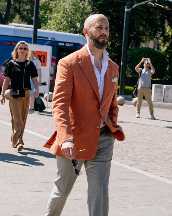
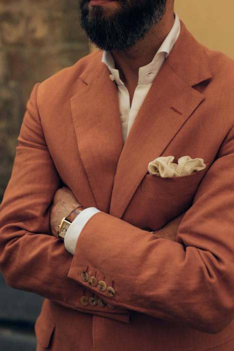
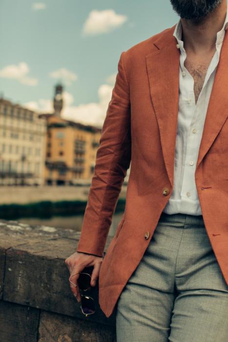
How do I feel about orange? This linen looked more like a terracotta red when it was a swatch, but let’s face it, it’s orange.
Fortunately I rather like it. Strong colour isn’t normally my thing, but when I do wear it, I prefer the colour to be softened somehow.
That comes over time with some materials – my Dege & Skinner tobacco suit, for example, was more orange than I had anticipated, but after wearing and cleaning and pressing a few times, really started to soften. And my other Anderson & Sheppard linen jacket, in a rather azure blue, was a soft colour by virtue of the white in the weave.
The linen shown here was unusual for being stonewashed, thanks to de Le Cuona, the interiors company that supplied it. More on them, and which of their materials could potentially also be used for tailoring, here.
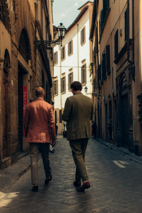
Bright colours always look more at home in brighter weather – summer, sun, and in this case the baking heat of Florence.
I feel that cities which see a lot of sunlight build their cities accordingly, certainly old ones. There are more buildings in washes of pastel, or in simple white. Terracotta tiles are complimentary too.
Of course it must be heavily dependent on local materials, but you feel there was some guiding aesthetic at work in all this. (Anyone with knowledge to add here, rather than just impressions, do chip in.)
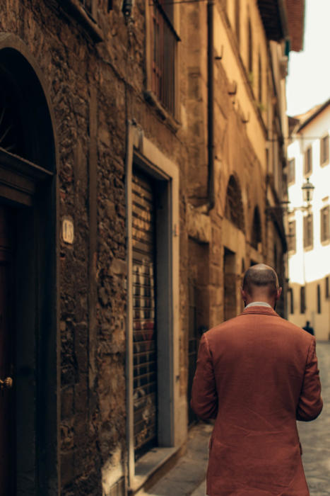
In this kind of environment orange linen seems at home. It certainly felt it as I went around appointments in town. In the fair of Pitti Uomo the colour was almost too subtle, like a washed-out version of what the peacocks were wearing. But around the city it almost blended with the brickwork.
One thing I wasn’t entirely happy about with the jacket was the lining and buttonhole colour. I wanted something that toned down the colour if I could, but this proved impossible.
There were no pale oranges, and no shades of warm brown or grey really worked. I haven’t given up looking, and may end up replacing it at some point in the future. (This is possible with button holes, though they’re usually not as neat afterwards.)
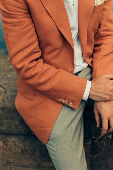
I ummed and erred similarly with the choice of buttons. If I want subtlety, does a brighter button achieve that because there is less contrast? Or is a darker button always better? In the end I went with the former, and that seems to have been right.
The other unusual thing about the material is the weight – it’s a 15oz linen, compared to the 11oz of normal Irish linens, or 9oz for most Italians. Interiors fabrics are rarely lightweight, as they need to be so abrasion-resistant, and de Le Cuona does even heavier ones too.
Interestingly I didn’t notice much difference in Florence though, even in 37-degree heat. I don’t sweat that much generally, but while I did notice a difference compared to the less structured Dege & Skinner jacket worn the day before, I didn’t notice one compared to that tobacco Dege suit, which is 11oz linen.
So my lesson is that while structure of a jacket – more canvas in the body, more padding in the shoulder – makes a noticeable difference, 4oz of extra linen does not.
That also applies to the benefits of those factors. Although this heavier linen flows beautifully, it’s a small difference compared to the slightly lighter Irish linen. The structure of a jacket, however, does makes a big difference to the overall look.
I had a couple of comments from friends as to how much they liked the way this jacket fit and flattered me. They preferred it to the less structured Dege jacket. Obviously the Dege was a lot easier to wear - but there are rewards for the suffering.
The padding in the shoulders of the A&S allows them to be pushed wider than my natural shape, while the canvas in the chest creates a sharp and elegant line, supporting that roll of the lapels and keeping the fronts sharp.
As we detailed in the first of these articles (it is the fifth of five, see article footer for the others), these design points were all deliberate, built off my experience with previous A&S cuts. But they wouldn’t have looked as good without that structure.
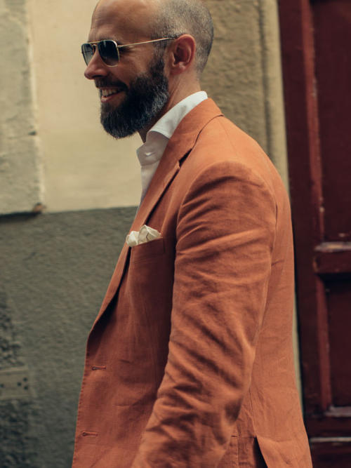
There’s also something to be said for having structure in linen in particular. Because while some elements will crease as soon as you bend your arms, or sit down, the front and in particular the chest and collar will retain their shape.
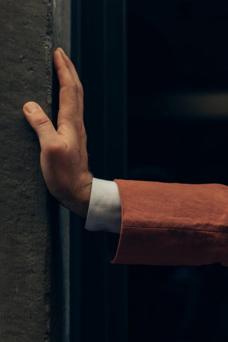
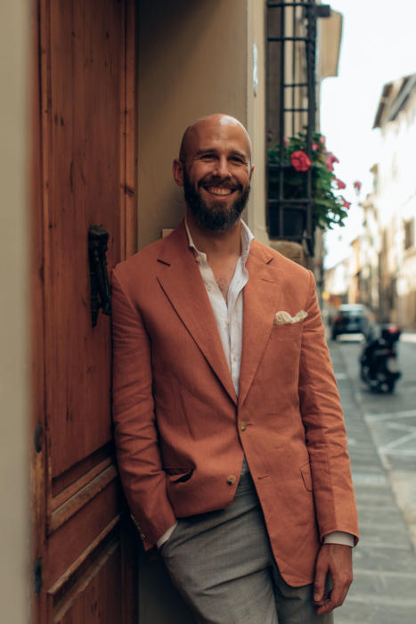
I think you can see that in the images here. It is 4pm on a very hot day, with the jacket having been worn and used since 9am that morning. The sleeves are rumpled to hell, but the chest and collar are still sharp.
This structure means there is a trade off with coolness of course, but I’d argue that it’s one worth making for any jacket designed to be smart.
If you want a linen layer that’s a lot cooler, it might be better going for something like an overshirt or shirt-jacket – an obviously more relaxed style.
The orange is not the easiest to combine with other colours, as you might expect. But so far I’ve found a couple I like.
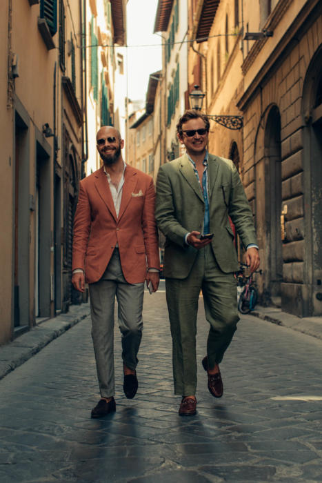
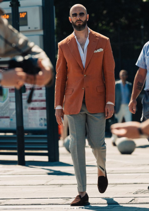
The jacket is easiest to wear with white or cream either on the top or the bottom. So here it’s worn with a white linen shirt and grey Drapers 2-ply trousers. I particularly like this shade of grey as it has the tiniest touch of brown in it, which stops the trousers looking too much like a suiting.
And the other option is white or cream trousers, with a blue shirt on top. Denim is especially nice – something about the faded appearance of both the denim and the linen means they compliment each other. I’ll take a picture of that some other time.
The jacket could work with other bright colours – a brightly striped shirt, or certainly a tie or handkerchief. But as I increasingly realise (and feel at home with) this is not my style.
Also worn here are a cream linen handkerchief, which seems to set the white of the shirt off nicely, and dark-brown unlined Piccadilly loafers from Edward Green. You notice the lack of lining even more in the heat.
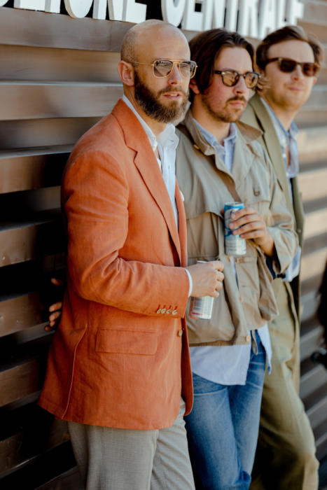
Pictured above, the PS team at Pitti - myself, Alex Natt and Lucas Nicholson
Photography: Jamie Ferguson except image above, Pontus Jonsén for Baltzar; and top and bottom images, Alex Natt.
The previous four articles in this series are:












Don’t change the colour of the buttons or the buttonholes. They look (very) good as they are. Bright choice of colour which proves that being audacious works (sometimes).
Congratulations to Mr. Hall for the cut, I think it looks much better than the blue linen Mr. Hitchcock cut for you. Lapels and quarters look somehow more harmonious.
I agree with Nestor’s comments here. Excellent fit which may, in part, come from the weight of the cloth.15 oz is heavy by any standard, even a worsted, and this is inevitably going to help with the drape.
If you were going to change the button (and I think I might be tempted to), I would go for a dark brown tortoiseshell. Currently, the lack of contrast may be a little bland, and this change could help that.
Reading that title made me think for a second that you were no longer going to commission from A&S. The horror! D:
Simon, I might be first off with the comments again but I want to congratulate you on this latest and absolutely stunning commission in a linen jacket from A&S.
I managed to get a few sample swatches of that cloth in different colours. It has a texture and ‘ripple’ which distinctly reminds me of seersucker…. but does it convey the same cooling benefits that come from seersucker… albeit in cotton… I do have a cotton seersucker jacket by the way. I may be wrong!!
I will hopefully, flights & London underground permitting, be meeting with Steed tailors in September for my first bespoke commission…. a jacket and trousers separates alternative to a bespoke suit. I want versatility, probably not double brested in a navy or dark blue jacket and grey trousers.
I will also visit Gaziano & Girling to have a look at their MTO service, I won’t go bespoke here… probably dark brown oxfords in espresso or a similar dark brown with a good depth of colour. We’ll see how it goes.
Lindsay McKee
Hi Simon, wouldn’t a brown trousers either in mid or dark shade work as well as cream or grey?
Beautiful jacket!
I didn’t find so Ali, but now I think about it, perhaps in a really dark brown worsted like a high twist. It didn’t look great in a brown linen
Looks great! I don’t think I’d wear colorful sport coat that much, though. I’d gladly have an orange chore coat or an overshirt
I’ve noticed that your jackets often look very sharp and almost a bit stiff? It’s in particular visible in the pictures with the man in the green suit, since his jacket in contrast looks more relaxed. Maybe this is partly beacuse your jacket is new and less worn and not only the style of the jacket? I think my personal style is more in line with his suit, especially when it comes to linen, since I think linen is a casual material. What is your opinion on this?
That stiffness – or to put it a more complimentary way – sharpness, is to do with the structure of English bespoke. Lucas’s is not bespoke and doesn’t have that internal structure. It sounds like you might like a more lightly made jacket, for example from the south of Italy
Yes, sharpness is probably a better word. I didn’t mean it in a non complimentary way, it was just an observation and a matter of personal taste. Please bear in mind that my native language is not English. Yes, the few jackets I own are mostly from Italian brands. I’m a long time reader even though the clothes often are too smart for me and my life, lately you have been covering more casual clothes which I enjoy. Still I think the tips, color combinations, material knowledge, mindset and the blog in general is applicable to a lot of clothes and styles. Keep up the good work, highly appreciate it!
Thank you Emil, and don’t worry it certainly wasn’t taken that way,
Not for the first time, I find myself coveting one of your jackets. I think we may have seen it in some Instagram shots prior to this final reveal? I thought then and even more so now that it’s a beautifully proportioned garment. Just enough structure without being too formal for the colour to work, gives an air of relaxed elegance.
You mentioned that you’re not happy with the buttonhole colour, but to me – within the bounds of photography – they look very good. None of the photos show the lining – what sort of lining did you go for?
I suspect that I would struggle to pull off that particular shade but in the right environment and combination it looks superb!
Thanks Paul.
Yes, there were a couple of live shots during Pitti on Instagram.
The lining is a similar colour to the buttonholes – a little more orange than I’d like, but there wasn’t anything else I preferred
I like this idea – there’s something wonderful about a muted/faded version of a strong colour that looks great without getting cartoonish. Something about the florentine air obviously works for your more colourful and outlandish outfits as well (purple Liverano anyone!). With the obvious caveat that screen colours don’t always come across accurately I’m unsure about these grey trousers. If you were wearing eg the tan/chino coloured trousers of those in the background on the top photo that might work better. I think Dieworkwear talked someplace about colour temperature being relevant in matching trousers / jackets – maybe that’s not harmonious with the combo here.
Thanks. That kind of tan certainly doesn’t work (I did try most things) but perhaps if it’s very pale
RE Italian City Architecture.
I went to an architects seminar on what makes an urban environment attractive.
Firstly, consistency of design. Individualism is OK by itself, but wrong when every building is different. A bit like every item of dress being a discordant pattern.
Italian cities are old and so local materials were used consistently giving consistent colours.
Because of same materials and weather conditions, techniques and designs were consistent over many centuries.
The cities themselves recognised consistency is aesthetically good. They would look to continue the same style, so buildings in italian cities may be built 300 or 400 years apart you cannot tell by looking at them.
It is not random chance, it was deliberate exactly as you dress.
These are my recollections on the talk, but i believe to be correct.
Neil
Thank you Neil, interesting
Wait–is there a PS team, or only a ‘Pitti team’? Care to introduce Messrs Natt and Nicholson?
Stunning jacket Simon; well done!
Hey Fred,
No one full time, but Lucas works on PS part time, running the shop side – anyone that’s been a customer and had interaction with the Support email would have talked to him since he started. Anyone that has come to the pop-ups recently would have met him as well.
Alex is freelance but contributes a lot of the photography to the site, and was shooting for PS during the week at Pitti.
RE Post on Jacket
Thanks for the comments on wearability, and comparison with other jackets in same conditions. it gives us enough information to understand whether we will be carrying the jacket or wearing it.
The comments on how it looks after being worn for a few hours, also tells me whether I will look like a sack of potatoes or sartorially elegant.
I love the colour and I like the way you have muted other items to let it stand out.
As a colour it feels like good company, vibrant but not shouty.
Interesting to see your comments on the weight of linen not being as important as the amount of canvas. This makes sense as linen is known for wicking capabilities, I am sure there is a limit as to how heavy before it becomes too heavy.
All in all an excellent article explaining every aspect and concern of buying such a jacket.
Thanks
Neil
I think it is a great-looking jacket, Simon. I like the orange colour and with time and some fading, it will look even better. It reminds me of Breton or Nantucket Red trousers I have, especially after they have faded with wear. And the jacket will pair nicely with a variety of trousers, especially cream and light grey, and also some of the darker blues. Perhaps, orange IS the new black, as the title of that recent TV series goes!
As someone born and raised in the tropics, my one concern is with wearing this jacket, or indeed any jacket, in 37-degree weather. Is it a concession one makes to propriety, in some sense? Unless there is an absolute need to be dressed in a jacket, why even wear one under such a blazing sun? In hot countries (Singapore/Malaysia, India, all countries I have lived in) people used to wear a white shirt and tie if formality is called for. These days, they might carry a jacket with them on their arm, to be worn indoors where there is air-conditioning. But wearing one outside, on a hot (and perhaps humid) day seems a tad excessive.
Thank you.
Certainly I would like to wear a jacket if I could on some occasions, which includes visiting tailors and others makers, or having appointments with makers, as I was here.
It’s also very practical – without it you’ll have at least two or three things that need to go in your trouser pockets or in a bag.
Although this was quite hot, the Dege jacket I covered recently really was not. When it’s open, in particular, if there’s any breeze to run through the jacket, it doesn’t make that much difference.
Even when on holiday, if in a town (as covered recently on my packing post) I’d wear a linen overshirt for the pockets, and it wouldn’t make much difference to the heat. Things like materials, walking slowly, being in the shade and being hydrated etc, all make a much bigger difference.
The number one in combining colours and tailored jackets (even with winter fabrics) is Al Bazar in Milan
Good point. Even if I wouldn’t wear a lot of what Lino wears himself in terms of style and fit, the colours there and in the store are often very well matched
Love the colour. Perhaps the summer has brought out my love of the Mediterranean .
Would you consider using peach or soft pink as a shirt colour?
Interesting. I didn’t try pink, and I will. I would think peach would be a bit too similar to the jacket, but maybe not
Simon, please button your shirts……having an open shirt halfway down to your navel is not attractive.
Appreciate the view, but I disagree – one more button is cooler and perfectly appropriate in this kind of setting as well
I’ve found that of all the “extreme” colours, orange is by far the easiest to mix and match; in fact, I have to keep myself from buying too many orange pieces of clothing, as it is of course pretty much impossible to wear more than one of them in the same outfit. And even if you only wear one, you can only do so a couple of times per month, otherwise you’ll be known around the office as “that guy who always wears orange”.
Can you talk about why you changed the pockets from patch to flap/jetted?
Thanks
Sure. On reflection I though it was too much of a risk to go for patches, as I’ve disliked English patches in the past. It would probably have been fine, but I erred on the safe side
The jacket is beautiful. PS philosophy manifested – smart but soft, unique yet subtle and muted. Well done. What I am most puzzled about, envious even, is how you are able to walk around in a jacket in Florence in the weather that was going on during Pitti. If I’d attempt to walk a moment in the sun with a jacket, not to mention spend a day in it, I (and it) will be soaked. Truly frustrating.
Cheers OP.
I do sweat less than other people. Having seen friends suffer too though, it does make a big difference if you do everything else right (as mentioned above) – walk slowly, in the shade, keep hydrated etc. Just slow down.
That’s good advice in most aspects of life.Thank you.
Perhaps a piece, at one point, offering options for the sweatier man? This outfit wouldn’t have worked as well without the jacket, obviously. Though, I doubt if there is a solution here (other then stripping the jacket down – cloth and structure). A jacket is warm, and nothing replaces it really. Smarter summer clothing have always been a challenge for me and I have always been reduced to a shirt or polo and trousers. Perhaps some tips regarding choices of smarter attire in the heat from your more perspiring friends?
Sure, good idea. I’d suggest having a look at the outfits I have worn with our PS overshirt – have a search on the site. That’s a good place to start.
Also the article here on dressing in high heat. Things like exposing the chest and ankles, and covering the head, make a biggger difference than whether you’re wearing a (lightweight, unstructured, worn open) jacket
I know Simon disagrees with me, but at least occasionally colour really matters. yesterday had to spend 30min near window in hot sun in white chinos, navy overshirt and black polo… legs were just warm, but my top was melting. also on the touch, chinos were barely warm while overshirt was really really hot…
I’d be interested to compare your upper half in different colours. The torso is always warmer than the legs as so much more blood circulates there.
well I’m not sure about white shirt, but black trousers and short sleeved Oxford, it’s about the same. in direct and really hot sunshine, my legs is baking quite a bit more than my top.
Ah OK. I guess we must just feel it differently then
maybe you’re just more heat resistant, but when you wear navy jacket and cream trousers in a bright sunlight you really don’t feel jacket itself getting hotter than trousera by the touch? it’s like when you touch a black car and a white car parked in sunlight. black will always be hotter than white…
I don’t notice any difference on my body, no, and what the material feels like on the outside isn’t that relevant really
like you said, maybe you just are more heat tolerant! in summer I’m deeply jealous of you!
but yeah, also not sure about the hat (extra layer on the top of the hair), so it’s a shadow Vs extra layer. noone makes straw hats in my size, but baseball caps never really helped.
but rest of your advice is really good.
I especially feel the difference when I simply fold back cuffs on your overshirt.
This jacket flatters you, Simon. I love the cut. You’re right the structure keeps some areas less wrinkled than one would expect after seven hours on a hot day. In these photos the color doesn’t seem overly bright. Did it look more intense in real life in Florence? How different does it look in England?
Thank you. No, I don’t think it looked intense in Florence at all. In England it would look more so, but still OK in town on a sunny day.
This is a beautiful jacket. Like you, I’m not a big fan of strong jacket colors, but this orange, particularly as it ages, looks fantastic. The cut of this jacket also looks really good. The more I see of Anderson&Sheppard the more I like this tailor’s work, probably my favorite.
Just love it, well made, everyone should have color in their lives.
Simon: welcome to the bright coloured jackets world!
The jacket looks a little shorter than other English ones that you have commissioned,hence more casual.A good thing.
Yes it is a touch shorter. You can see in the Style Breakdown series of course how all the jacket lengths compare. A&S is not the longest
The orange jacket reminds me of Toni Servillo as Jep Gambardella in the movie “La grande bellezza”. He is dressed with elegant with „sprezzatura“ throughout the film.
He wears the orange jacket with a white/off-white trousers, maybe a combination to consider?
Thank you for the compliment, he is wonderfully elegant. That combination would probably be a touch too bold for me, though I will try it just in case
Hi Simon, I notice the jacket has a ‘side body’. I always thought this pattern feature is typically skipped by bespoke tailors in favour of less noticeable ways of bringing shape to a jacket. Am I wrong? Or is this typical for A&S?
No, quite a few bespoke tailors do it.
Beautiful jacket and wonderful combination with shirt, pocket square and trousers. Is it just me or the flaps on the pockets appear to be placed relatively low? For some reason, I would find it more visually attractive if the jacket was little longer regarding the placement of the pockets. In addition, may i ask you how do you like such a lightweight cloth for trousers? I ordered medium grey trousers in same quality (Ascot 2 ply form Draper’s) and I’ve been having afterthoughts if asked for too light a cloth for nice tailored trousers.
The trouser material is certainly borderline – with that lightness, you’re getting a trouser that is the very lightest it can be and still hold its shape. It won’t be the most robust material in the world.
Thank you. I’m looking forward trying them myself.
Great jacket. I prefer more color in my summer jackets and see no problem with the orange. It makes you look youthful. And the structure for coolness tradeoff is definitely worth it. I’d have gone with an even more textured trouser myself.
It strikes me this fabric and color could also make a nice pair of separate trousers without the jacket. If done as just trousers, do you think they’d come across more as a heavier, Irish linen (more appropriate for tailoring only), or as a lighter, Italian linen that could be worn more casual?
I think they’d be something in between, having the weight of the Irish and more texture like a lighter weight. Personally I’m not sure it would be great as trousers though – or at least only an occasional, striking one
Like others, I think the buttonholes and buttons work very well. They did not stand out to me, and barely registered until you called attention to them. At least in these photos and this combination, they both seem appropriately subtle. The buttons are helped by coherence with your trousers, so possibly a different colour on the bottom might affect that.
I appreciated your reflections on the relatively small difference between 11 oz and 15 oz linen. In light of that, for your next linen jacket or suit, which weight would you prefer now?
Thank you, that’s good to know!
Given what I’ve said here, I might be likely to make the choice based on something other than weight, if that makes sense? A colour I like, a texture etc
Sure, makes sense. Basically you have no preference on weight and will ignore it to focus on the other elements of the cloth.
Perhaps not ignore it, but shuffle it down the order of priorities, yes.
Lovely breakdown as usual, cheers Simon. You’re bang on, this lovely shade looks right at home in the warm, hazy glow of Florence. That’s a beautiful cut, shoulders do look very very clean and strong.
I made comment about this jacket when you first posted on Instagram, you must have still been in Italy. What grabbed me immediately was the texture as opposed to the colour, which I find interesting. That’s maybe one element of my aversion to strong colour, it always seems to steal some limelight from texture.
However, whether it’s due to the softness of the colour, or the wash of the linen, the texture stands out first for me with this jacket. White shirt, grey trousers (well noted on that hint of brown) and brown suede EG’s. Can’t go wrong.
Thanks CK. I think that’s the stonewashed nature of the
This jacket is a piece of absolute beauty. That’s is one of the things I really like about your blog – I don’t think I could pull off such a colour of a jacket, and my life circumstances are unlikely to present me with an opportunity to be able to wear such a piece. But that doesn’t stop me being able to really admire it, and I agree that the structure and fit – together with the colour of linen – is perfect in the context of a sunny southern European city.
Hi Simon.
Very nice and flattering jacket. Perfect cut and colour. If I may, how much did this cost, including fabric and stitching.
Cheers
AKG
Thank you. It was £3650
Hi Simon,
Whereas I love the cut of this jacket, I find it to be the least versatile of all your jackets featured on this site, the Liverano included.
John
I think you might be right John, though I think interestingly some of the more unusual cuts are just as unversatile, even perhaps more. Such as the navy Chittleborough
Hi Simon,
I really like your sunglasses. May I ask which brand they are?
Thank you. They’re from EB Meyrowitz, the Californian model.
Hi Simon – I too am a big fan of these glasses. When I search EB Meyrowitz’s California model, it is a keyhole design, plastic framed glasses vs the gold aviators shown here. Greatly appreciate your help!
Hi Jeff,
I am sorry, I was looking at the wrong article when I answered originally.
These are not from Meyrowitz, they are a vintage pair of gold-rolled Caravans from Ray Ban, made in the 1950s. Bought from Retrospecs when they took part in our pop-up shop
Good evening Simon, everybody!
Very nice jacket, it flatters you more than the -somewhat conservative in my opinion- Dege & Skinner tobacco brown linen suit, both in color and pattern (mostly in pattern). Elegant lapels, interesting buttons. It… “smells” Mediterranean summer, Acqua di Parma colonia!!
I also like it more than your Anderson & Sheppard, bold colored lapis – blue linen jacket.
To tell the truth I’m not a fan of summer jackets, as a stylistic point of view, but as a practical one too. Athens is a very hot place in summertime, hotter than Florence. I prefer my trousers made from the “lighter” ARISTΩN Delave, 100% linen, 270 gr fabric. With short sleeved, cuban collar cotton shirts, always tucked in. And tassel, always, leather or suede.
That dull, faded (can’t find the right word in English) orange color, works beautiful with the grey pants! I think beige or dark green would be a good choice as well,
Thank you for the “cool” article, gave courage to us who haven’t left for summer vacation yet…
Cheers Dimitris, and I like the sound of your summer uniform as well. I’d prefer the slightly heavier Irish linen for the trousers, but that’s a very minor thing!
Are the gray Drapers trousers your Cornacchia ones? Do you still think the 2-ply version performs less well than the 4-ply?
Yes they are, and yes I do. The 2-ply is great, but the 4-ply will always hang better and be stronger
A beautiful jacket Simon.
I have a rust coloured linen jacket with some subtle checks that I love and wear often in summer. I too have found it works best with grey or cream trousers and blue or white shirts. It’s unstructured so it also works very well with denim.
If you find other combinations that work I’d love to see photos of them!
I love the cut of the jacket. If A&S came to the USA more frequently I would still be commissioning things from them. I think I’d find the color hard to wear, personally. Compare it to your jacket in lapis blue. Both are bright, and somewhat striking, but the blue jacket is still, well, blue, and that makes it much easier to pair… which is why I had a jacket made up in the same fabric! And It’s become one of my go-to summer jackets.
superb – it could be complemented with a black shirt –
I think that would be a little harsh Brendel, but I’ll try it and see
I think the terracotta linen jacket looks great & works very well with the lighter grey trousers. Yes you’d need to be somewhere hot & urban ( maybe London if this weather continues ) & the shirt & pocket are spot on. A nice tan would finish it off, so happy holidays.
Cheers Steve, I’ll do my best!
“Bright colours always look more at home in brighter weather – summer, sun, and in this case the baking heat of Florence.”
One of my issues with menswear that irks my nerves is that so many are either afraid of bold colors and/or they think bold colors are seasonal. I understand the issue of color in menswear has become sort of institutionalized. In my opinion bold colors in fall/winter fabrics wear just as well in the fall/winter as bold colored spring/summer fabrics wear in the spring/summer time. Men can break from convention or conservatism while still being tasteful. And, I am not alone in feeling this way. Many men are tired of the same drab colors that take the fore in men’s fall/winter clothing on a retail level while at the same time these drab colors can be absent from look books and the like. I think it’s a waste to not play with color regardless of the season of the clothing especially if you are buying MTM or bespoke clothing. Lastly, wearing bold colors does not mean garishness.
Thanks Booker. It’s less my taste, but absolutely stronger colours can look great in colder months too. I think they’re different still, perhaps – eg more saturated and less pale or pastel, which often looks a little better in warmer weather. Eg see today’s article about purple socks
Dark blue trousers and a matching dark blue t-shirt (preferably with a high cut rounded collar) and a dark blue pocket square with a hint of pattern would look great with that jacket.
Thanks Russ – I did try navy briefly and it’s not a great partner for it
The pockets look a bit low no?
They are a little, yes. I think it’s OK, but they’re on the borderline.
The position comes from sticking to the principle that they should be in line with the second button. And if the buttoning point is low, the second button is pushed lower, and so the pockets are too.
Good evening..i love the color of your sports jacket…why not…it’s summer …enjoy…fans of Permanent Style…have a wonderful weekend..peace and cheers
Hi Simon,
How casual would you go with the Piccadilly shoes (in calf and in suede)? Can you wear them with shorts, jeans, chinos? Or are they more appropriate with dressier trousers?
Thanks
Dressier trousers really. I’d prefer the Belgravia for more casual trousers, and even then only in suede and not with shorts.
What would be your go to penny loafers for chinos? Would your C&J Harvard be a good choice? Maybe the John Lobb Lopez as well, as it is more rounded and perhaps not too smart looking?
Thanks again
Yes, either would be great. A slightly more high-walled American style, compared to a slimmer loafer like my Belgravia. But a great style for chinos
Thank you so much. I think discussing the features and levels of formality of a penny loafer would be a great topic for a post, since these are very commonly worn from casual to more formal settings.
Good point John, thanks
I would have paired the Jacket with olive trousers which will work with just about any shade of olive. Orange will work with more colors than one would think; I see wide range of browns, navy, grays and greens (in darker shades). Definitely, a summer jacket color but still more subtle than most summer pastels which is less restricted, as far as, color pairing. Orange is definitely an interesting color to consider.
Thanks Robert. I think you’re right about some shades of orange, though I have tried a few of those trouser combinations and they haven’t really worked. Certainly not brown or navy, but I will give olive another go.
Hi Simon,
I’ve noticed in your A&S commissions you can see more shirt cuff at the front than the rear. ie the jacket cuff is not cut parallel to the shirt cuff. Is this intentional styling on an A&S jacket?
Thanks
Yes it’s interesting isn’t it? I think sometimes that’s exaggerated a little in photos (eg obviously depends on your arm position) but I think there is a little slant there. I’ll ask Danny about it next time I’m in
I imagine it will be stylistic as it is consistent on all your A&S jackets.
Interestingly, I had a fitting with Ciardi yesterday and his cuffs were doing the same. He said he always has 3cm at the front and 1cm at the back showing.
On a separate note, wow Ciardi nails a first fitting. His jackets are lot better in the flesh than online. Thanks for the nod.
Nice, great to hear
Hi Simon, could I ask what is the fabric code for Drapers trousers if you know what it is?
Many thanks,
Jack
It’s the 2-ply in the Ascot bunch, originally covered as part of a suit here. I suspect the code may have changed by now
Great, thanks Simon.