Rejoice and give praise: the world is a beautiful place. High art is not dead; aesthetic creativity lives on untarnished. This is a great time to be.
Pulse-racing inspiration is merely a click away, on the mannequins of designers such as Domenico Vacca, Cesare Attolini and Michael Bastian.
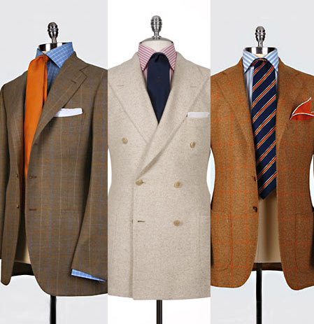
The three examples above are all from the collection of Domenico Vacca. He has a reputation for rather extravagant designs, particularly shoes and luggage in branded alligator leather. But Vacca has a sense of colour and pattern combination to rival anyone.
(It may be fundamental to note that Vacca himself dresses with simplicity in the portrait on www.domenicovacca.com. Although the shirt is undone one button, possibly two, too far, his navy suit and simple white handkerchief betray a different aesthetic to the one he is known for.)
To the images selected. The first demonstrates one of my favourite colour combinations – bright orange, blue and brown.
Orange is not an easy colour to wear well, given that it is most attractive when rich and bright. It requires a blue background (more understated, more stable than any other shirt colour) to sit easily. Here, Vacca’s blue shirt has a mid-size check, which works nicely with the plain tie.
The jacket, in a brown/grey, is again a mid-tone background that supports the tie. Navy would make the tie appear brighter, plain grey would have little in common with the earthy orange. Brown works best.
The orange check to the jacket is a nice touch but not required. The important aspects of it are that it adds visual interest (along with the handkerchief) to draw attention away from the tie, and that the check is on a different scale to the shirt.
The central image shows a great way to add variation to a background shirt/tie combination. Normally with a jacket that pale, I would go for a blue tie on blue-striped shirt. The jacket is everything about the outfit; the other elements should pull back. But a close red stripe works well and gives me inspiration to wear my own red-striped shirt with navy.
Image number three is a great combination of colours – brown, orange, blue, navy, white and red. But its greatest asset is the combination of patterns. That didn’t even occur to you did it? The blend is so subtle as to dissolve completely.
The density of stripe in the shirt and tie aren’t that dissimilar. But the tie kicks away from its partner in the contrast between navy, red and white. There is no chance of clashing there. The jacket, meanwhile, has a different pattern, in a different colour, on a different scale. No clash there either. And if you count the bordered handkerchief as another pattern, that’s four together without anyone noticing it was happening.
Clothing combinations like these inspire me. If someone can put their clothes together in such a beautiful way, it connects me to their brand more than the workmanship or advertising. Ralph Lauren and Hackett are also past masters – check out their shop windows.
Being able to do something so uplifting with the same elements of jacket, shirt and tie is the genius of menswear.












Guest Comments »
1.
Simon,
I have said this previously, I will say again that your sense of colour combination is to me brilliant. Of course, as it should be, in the past, we have had held different viewpoints on smaller issues, however in the broader picture we agree. I consistently see a pattern of talent in you when it comes to your pointing out unique colour and patterning. I appreciate these pieces, and always keep my eye on what you are focusing your eye on for us to consider. Best, Nicola
Comment by Nicola Linza — January 29, 2009 #
Many thanks, Nicola. You thoughts are always appreciated.
I should also say that I welcome your views especially when we disagree!
Debate is the food of knowledge
Absolutley stunning. This is why I continuously visit your blog – the inspiration found in pictures like these.
This comment has been removed by a blog administrator.