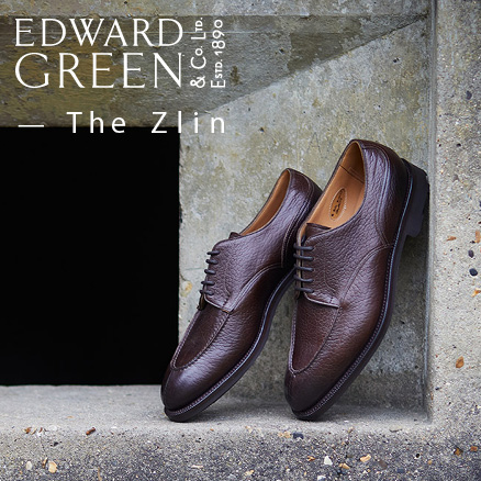
This column in Japanese magazine Free & Easy is the result of the photo shoot I posted about before Christmas. I have no idea what the Japanese text says, but hopefully it faithfully reports my opinions on shoes and shoe collecting, and describes the shoes pictured – from Cleverley, Gaziano & Girling and Edward Green.
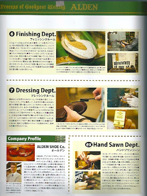
The magazine itself, a shoe special, is a wondrous thing. So many shoes; so much information. There are several obvious errors, at least in the English: Leffot in New York is called ‘Effot’ and the John Lobb feature includes a section called Closing which is actually lasting.
But you can’t knock the volume and depth of information, with step-by-step profiles on Alden, Foster & Son, Lobb, Tricker’s and others, as well as pages of catalogue-type listings.
But you can’t knock the volume and depth of information, with step-by-step profiles on Alden, Foster & Son, Lobb, Tricker’s and others, as well as pages of catalogue-type listings.













Am trying to decide: Is that “Free & Easy” typography so tacky it’s hip and cool? Or just plain tacky?
John you wouldn’t be so sceptical and ignorant in your reproach if you judged by the content of the magazine. It’s one of the best menswear magazines out there in my opinion, much more relevant than the shit they sell in Europe and America. Highly recommend it, and considering that English is obviously not a native language in Japan, the title is excusable.