It’s not easy to spot a high-quality tie. Most of the signs that people tell you to look for, such as the loop being sewn in between the folds rather than tacked across, have no real practical benefit. They are just signs that a little more effort has been used (it takes longer, so it’s more expensive to make, so they must have spent money elsewhere).
There are some genuine signs. The slip-stitch down the back must be done by hand – but then that’s the case with many ties these days. Equally, there should be a loop of thread left over at the thin end of the tie, allowing it to stretch and wear along its length over time.
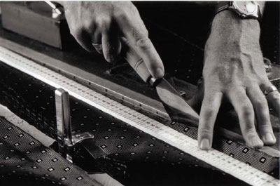
But the real problem is most men can’t assess the quality of silk (probably the most important thing in a tie). It’s also hard to tell whether the silk has been cut on a perfect 45-degree angle. And they can’t even see the interlining – let alone know whether the stitching has joined the lining all the way down, rather than leaving it floating.
All these things will only show themselves in a few years, when a man’s tie twists, curls or the label comes off.
So it’s rather reassuring to see your tie actually being made. This week Michael Drake, of Drake’s in London, was kind enough to take me round the factory and explain each of these manufacturing steps, as well as which ones make a difference to quality and which ones are just aesthetic.
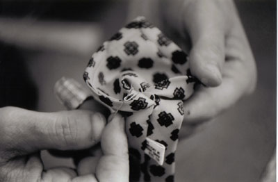
Sewing the loop (on the back of the front blade) in between the folds is aesthetic. So is the size or prominence of the first stitch in the slip stitch down the back. But sewing anything by hand makes a difference to quality – with the slip stitch, for example, it allows flexibility and movement along the tie. That stitch also has to perfectly catch the two sides of the tie, one folded, and connect them to the interlining – never catching the front of the tie. It’s not easy, yet the lovely ladies at Drake’s did it unerringly quickly.
The only parts of a Drake’s tie that are sewn by machine are the joins between the three parts of the body (front, neck and rear) and the tipping. In these cases, sewing by hand would hardly add anything in strength or durability.
Printing is part way between the two. All Drake’s ties are hand-printed using the traditional English method of dye and discharge. This means that the ground colour is discharged into the silk first, creating a background that the pattern is printed on. So the background may be dyed navy and then red spots, say, discharged onto the silk. As the pattern has to discharge through the silk, it is a tricky process – too heavy and it will soak through, too light and it won’t sit in the material.
The alternative, Italian method is sometimes called ‘print-on’. Here the pattern is always printed on a white background. So the navy is printed as a pattern that leaves spaces for the spots; then the red spots are printed in those spaces separately. It is cleaner and easier.
The resulting pattern is sharper and brighter. Think of a classic Ferragamo tie, or an Hermes print – those are done with the Italian method and are generally sharper than English ties.
This is all practical and objective. What is less objective is which looks nicer. Michael describes the English method as “more traditional, classier, antiquey, classical”. And it is certainly what I prefer (though that’s probably because I’ve never been able to stand the ‘irreverent’ animal prints that are Hermes’s signature).
More importantly, this English look is what Drake’s international clients want. The company was started as an export business and that is essentially what it still is. (Incidentially, it also started as a scarf business, and would still make as much money out of scarves were the former not so seasonal). So French and Italian clients want ties that have a traditional English look, which requires dye and discharge.
Indeed, there is an irony here. Many of the Drake’s designs are done with foreign clients in mind. One I particularly liked was a deep orange with alternating blue and brown flowers. Great with a grey suit and brown shoes, not to mention a strong tan. Not so good on a pasty Englishman that tends to avoid strong colour. English printing, Italian patterns.
One reason export has always been so strong for Drake’s is that both France and Italy have a large, conservative establishment that is very international and takes an interest in clothes. England, despite its wonderful history in clothing, tends to either be naff or very fashionable.
It explains why Englishmen uphold the Italians as such good dressers, but many that visit complain that all Italians dress the same. To me, the quirks of Paul Smith are just gimmicks; to others, they are the wonderful individuality of the British male.
The Drake’s Autumn/Winter 2009 collection goes on sale on Wednesday next week. Check it out. (www.drakes-london.com)
Photography: Andy Barnham













2 Guest Comments »
1.
And their service is wonderful. I took delivery of a tie just this summer. It wasn’t in the colourway I originally requested, but they were kind enough to email me and mention that it was sold out and would I like to choose another or have a refund immediately? A very comforting exchange.
I shall buy from them again.
Comment by Easy and Elegant Life — August 27, 2009 #
2.
Nice Story! I’m new here and I must say that I’m impressed by your content. I own a mens fashion blog so I know how it is to come up with fresh content. Keep the stories coming.
Comment by Mens Style Manual — August 29, 2009 #
Thanks to your articles I bought my first Budd shirt and Drakes tie today. I look forward to many years of patronage after disappointment with declining Pinks quality… Thanks!
I’ve always wondered about this cutting on the bias. I know how to detect it, but visually it’s very hard to spot. For instance I have a Drake’s tie that has lines straight down. Was that woven taking the cutting on the bias into account?