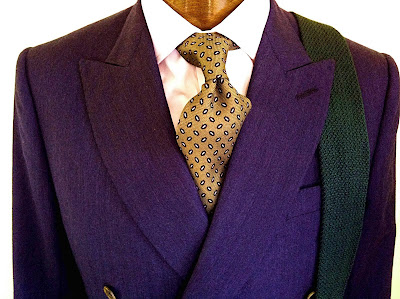
One of my favourite colour combinations is pink and green. The pink here is pale, too pale perhaps to be portrayed accurately in the photo, but it provides a subtle field of colour for green to play on.
The green tie, from Neapolitan maker Isaia, is a muted, brownish version of that colour. And it is important to note that a darker and more muted shade of any colour will always be smarter. Hence the Isaia tie here produces a smart effect under the blue suit (double-breasted, from Graham Browne) despite the unusual colour combination.
The point about muted colors is something men often get wrong. A dressing book from the thirties, for example, instructs men that pink is fine in a shirt as long as the shade is pale enough to be manly. Many find that last phrase counter-intuitive.
Over the shoulder is a green knitted tie (Drake’s) in a much stronger tone. While this would go as well with the suit, the effect would be bolder, less formal, younger and preppier – in line with the preppy tradition of strong colour. Indeed, the place you are most likely to see a combination like this on the high street is in Ralph Lauren, who is worth studying for his strong colour combinations.











Simon, I was told a while ago that an Englishman never wears a green tie because it’s unlucky! And this was from someone who’s spent their whole lives in the tie business (who you’ve featured here…).
Green cars also have a lower re-sale value for much the same marketing reason.
Simon, what knot is that, and is it a particularly broad tie?
A four in hand – I tie nothing else – and the width is 3.5 inches. Not particularly wide, but many these days are made narrower.
That is an interesting colour combination, I had never thought of. Thank you for the inspiration. (Oh, I can only recognize the tie over the shoulder as green, the tie from Isaia seems kind of kaki-beige in the photo).
An Aston in variants of British Racing Green is the exception, of course; very sought after indeed and increasingly rare!!
Pink is manly; in fact, only real men would have the confidence to wear pink. I was wondering, what shades of green do you think work with pink? I have various pink shirts, ties in a gamut of green colors, as well as a dark olive sport coat. Are there other colors you would recommend with pink, or with green?
All shades of green work with pale pink, other than the very bright or pale lime greens.
As to other ties to go with pink shirts, navy is the default, black can work well and purple is good if the two tones aren’t too similar. I agree with other readers than grey goes well with pink, but more as the suit than the tie. Grey flannel with a pink shirt is lovely.
Simon, your articles on unusual colour combinations have been very helpful in helping me out of my rut of navy, white and light blue. I’ve also found that the combination of pink and green transposes very well to knitwear and casual shirts. Inspired by this article I’m currently wearing a cashmere crew neck in much the same colour as the green Drakes tie above with a very pale pink oxford, chocolate brown cords and sand suede kicks. The pink really lifts what could otherwise be a fairly pedestrian (at best) combination of dark green and brown.
The key is definitely in choosing the lightest shade of pink possible. My ideal pink shirt is almost white with the faintest pink blush. In a rugged Oxford cloth it makes a wonderful alternative to white, a colour I’ve always found difficult to wear as a casual shirt.
Incidentally, a soft pink also makes for a very, very attractive colour for a watch dial (http://tapatalk.imageshack.com/v2/14/09/03/eb45368d58ff3668ff6436228db7db3c.jpg)
Thanks, yes love those pale pink Oxford cloths
Why do you only tie a four-in-hand? There seems to be quite a lot of people on places like Styleforum who insist the same; usually on the assumption that its slightly off-centred angle creates “Sprezzatura”, like a stuffed handerchief rather than a geometrical pocket square.
I’m less convinced. Certain ties work better with certain knots and the spread of the collar plays a role too.
Sprezzatura might be one way to think about it. But I just think it looks better. Any other knot is too square. It looks out of proportion with the rest of the tie. I have little other rationale for it, but I have never seen any evidence to make me think the contrary, and every man I consider stylish agrees. That’s enough for me.
Re knots, have you ever tried the Plattsburgh or the Christensen? Neither is square.
http://www.tcm.phy.cam.ac.uk/~tmf20/tieknots.shtml