The colours and combinations of Hermes
The silk and leather headquarters of Hermes are in a pretty nondescript set of white buildings just outside Lyon.
Here, there are the 100m and 150m-long silk printing tables that I described in our previous post. There is also a new two-storey building full of leather-goods hand-sewing.
My favourite room by far, however, was Delphine’s colour room.
Here, the season’s designs for silk scarves and ties are given their colourways - usually between three and five of them. Creative director Veronique Nichanian and men’s silk director Christophe Goineau give their direction, and Delphine turns them into full designs.
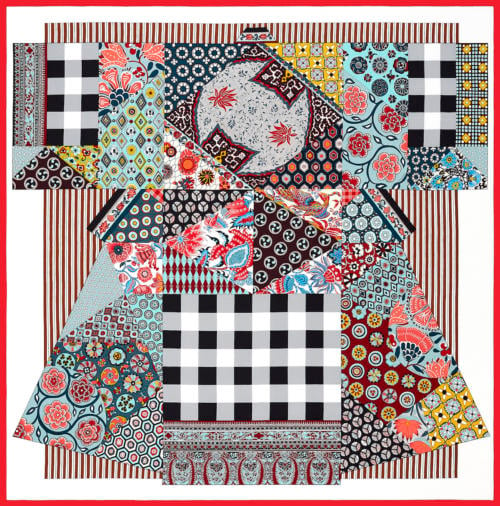
It’s like colouring by numbers. The scarf designs are fairly graphic, often with black outlines, and so it’s a question of picking colours, tones and shades for each of the little areas.
Interestingly, the role of the Hermes team here is completely different to that of the original artwork.
With that artwork, the external artist is given free rein. Sometimes, designs are delayed by a year or more just because the artist isn’t ready.
But when it comes to what colours will be used on the design, the Hermes team has the final say. And I find it fascinating what they pick.
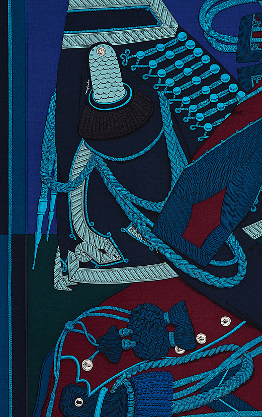
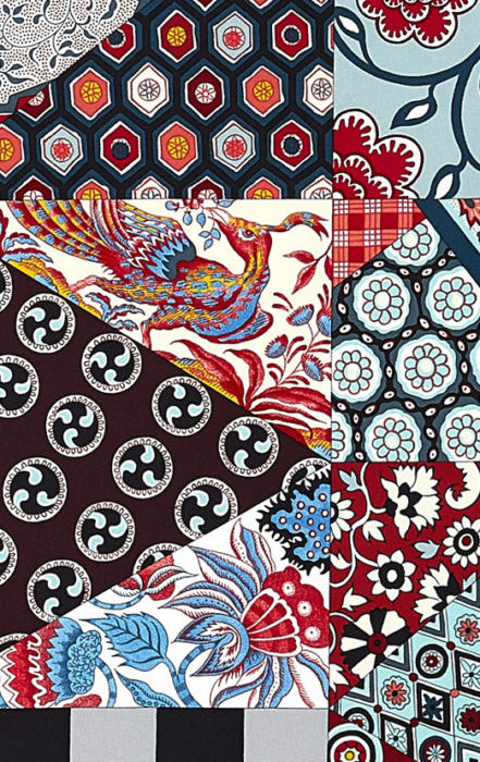
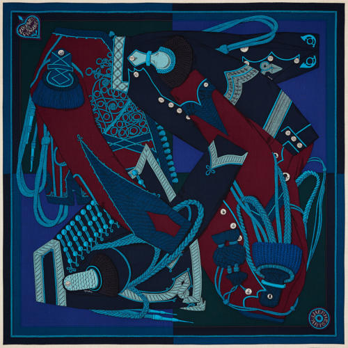
For example, often in one area of a scarf, three or four dark colours will be sat next to each other.
There is little contrast between the colours, and it’s only on close inspection that the interplay between them becomes apparent.
When it does, it is rich and unusual.
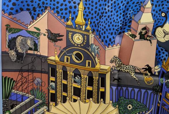
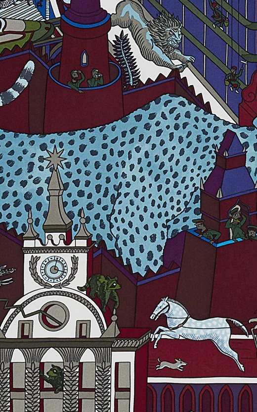
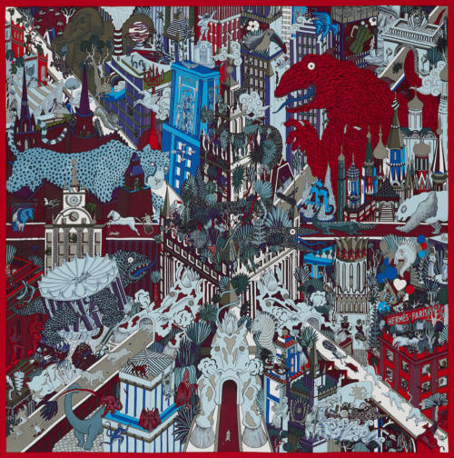
In the scarf above, brown, maroon, blue and purple are all used in the shading of a tower. A simpler colouration would use two - and even those two would be more conventional.
“The colours Hermes uses in these areas are what set its scarves apart from anyone else working in silk,” commented a silk-mill owner to me. “Some of the designs themselves don’t appeal to me, but the colouration is always fascinating.”
Compare these combinations to what we normally get in classic menswear, which is too often bright or unoriginal.
Handkerchiefs will usually be just dark grounds (eg navy) with bright patterns (eg white). Or mustard yellows and forest greens, with orange horses or brown pheasants.
Collaborations like Drake’s with Kristin Texeira, or Christian Kimber’s hanks, are better, but the majority are starkly unoriginal.
In Delphine’s room, there is a binder of silk samples. Each page has about 100 small swatches of silk, coloured to a particular shade, and there are over 80 pages.
Each of these thousands of colours has been used before on an Hermes scarf. Each has been dyed specifically by them. So there are dozens of creams, dozens of turquoises, all set out to choose and try.
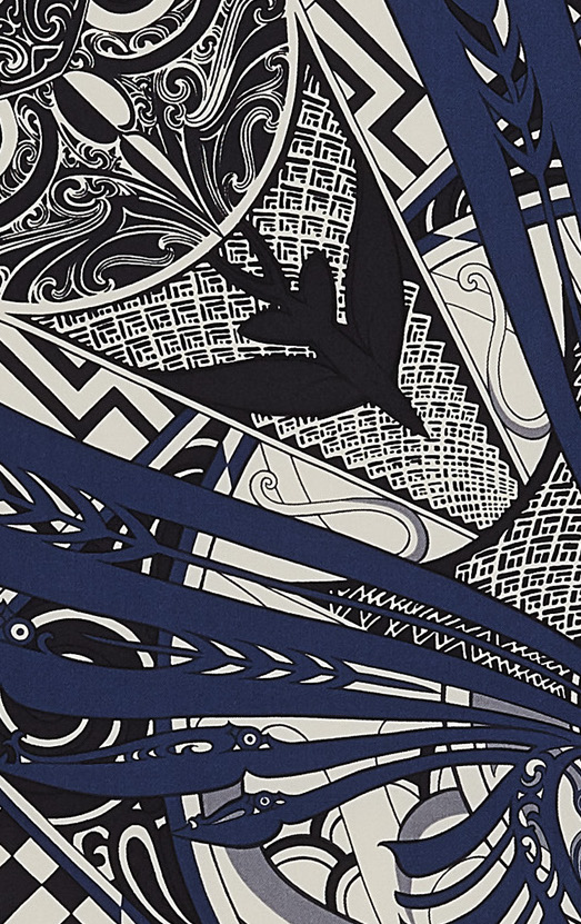
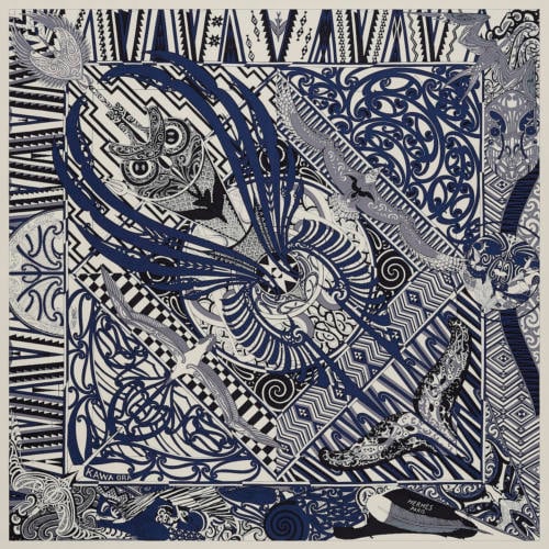
There are themes as well: the season that we saw being put together, a bright lemon yellow ran through a lot of the new designs. And there are classics: the same shades of navy and indigo are used across a lot of men’s designs.
But the shading and the details is where it gets interesting.
An effective counterpoint to production in Lyon was interviewing Christophe Goineau the next day, in Paris.
The office, just outside the city centre, is also fairly discrete. It’s not until you get inside and see the staff that it becomes obvious you’re at Hermes.
Interestingly, Christophe (also a Permanent Style reader) started at the company as an intern on the commercial side. “When I started, I thought Hermes would be such a conservative company,” he says. “But I was surprised how modern it was - specifically, how often it reassessed all its processes, from the tiny details upwards.”
One of those areas that impressed him was the focus on colour. “People would spend so much time on tiny colour combinations - doing a whole new frame just to try out one idea,” he says.
“I used to think that pattern was by far the most important thing in the designs, but that changed. I’m fascinated by the colours now - I think it’s one of the most interesting jobs in the whole company.”
Christophe (above) learnt about colour largely by regularly visiting that production centre in Lyon.
In the centre of the building there is one room called the ‘kitchen’, where all the colours are mixed to get the right shade. Every surface is covered with strips of paper, covered in brushstrokes of tested combinations.
“Seeing how everyone worked in the colour kitchen was both inspirational and educational,” says Christophe. “Being shown how a twill weave affects the way colours merge together, for example, and differently on silk or a silk/cashmere mix.”
He also finds it interesting how cultural attitudes to colours are. It’s often self-conscious, but Americans will buy brighter and stronger colours, particularly red, while Japanese are more conservative.
Although Hermes has just one collection, each store buys its own selection from it, so Christophe can see which are the most popular in different regions.
In the end, the reason I probably found talking to Christophe and Delphine so interesting was that they do the same things we do every day: they play with colour combinations.
We do it when deciding which tie to wear with a certain jacket and shirt; they do it within the bounds of a silk or cashmere design. The inspiration - and the aesthetic stimulation - are very similar.
“If I had one recommendation for picking a scarf, it would be to make it emotional,” says Christophe. “Like a tie, it’s a very personal thing and quite selfish. It’s less about what you should wear and more about how you want to express yourself.”
I’d temper that by saying it should be something versatile, given the expense, but go with Christophe’s approach first. It’s a lot more fun.
Read about how my visit to the factory, and see examples of the scarves being worn, here.
Photography: Hermes, except portrait of Christophe, Alede Nicolai

















Have other luxury groups never tried to reproduce such an expertise in the use of colours? It does not seem to require enormous investments.
It is quite a lot more expensive, because of the number of colours needed. (See previous post on Hermes). Nonetheless, you’re right, most brands don’t invest as much in original design or colour expertise either
Hermés scarves, the textile version of precious jewelry, ultimate objects of mindless consumerism.
Hermes is a brand with a great heritage that pays enormous attention to detail to quality.
Why then is it so incredibly boring ?
The stores don’t provoke any emotion and are not so full of Asian women running around with little orange parcels who all look embarrassed to be selling or buying nondescript goods that are obscenely priced.
Jason I simply don’t understand your comments.
The brand and the products clearly have global appeal, are recognised for their craftsmanship, are sought after, are capable of commanding high prices, and have a distinguished heritage which has not, so far at least, been compromised on the altar of consumerism.
My grandmother was a very elegant Parisian who considered herself under-dressed if not in a Chanel suit with a Hermes handbag.
High prices yes, obscenely priced no. And far from nondescript.
The quality of Hermès is still top and selling well but I find the style has become of no interest in the case of menswear and shoes. The design of a plain leather jacket I loved 30 years ago has been changed several times without any clear direction other than addressing a wider consumer base (older fat and sartorially uneducated) that is necessarily affluent rather than elegant. In the end that jacket they now sell is not elegant anymore, a shame given the quality of the leather and the finishings. Same for shoes, including JL.
As much as I like Hermès products, I find most of these pocket squares and scarves to be quite garish in design. They do not appeal to me at all. The fourth, seventh and tenth images (more understated in palette and composition) are quite elegant though. I’m a bit surprised you would be referring to the designs of Drake’s as “unoriginal.” It seems to go a bit against the aesthetics of “Permanent Style.” It’s a bit of a facile way of equating “classicism” to “unoriginality.” But I’m also open to freedom of design, and in that sense it’s quite a good move for Hermès. If you have become interested in such busy prints with collages and a spectrum of hues, why don’t we see it upon your shirts and ties and suits perhaps–in photographs. Or how about relating them or giving credit to Versace prints for instance or those of other designers. While Versace prints may not be what interest me, they remain a part of the historical trajectory of fashion/costume design.
What compelled me to respond to this interesting article was your use of the word “unoriginal.” Sorry if my comment seems to be a bit critical.
Thanks. I’m pleased you like those combinations, but I wouldn’t really use them on shirts or suits. More in accessories, and particularly scarves and handkerchiefs I think.
On ‘unoriginal’ I’m not sure you can’t be very classical and yet reinterpret and introduce original colours, if subtle.