Summer was heralded for me in a subtle, sophisticated way by the palate of Paul Stuart, as reported in previous post A Fresher Take on Summer. In that article I compared the subtlty and still unusual colour combinations of Paul Stuart with the bolder, and certainly no less inspiring Ralph Lauren approach.
Fortunately for me and the style world at large, Paul Stuart’s autumnal suggestions are just as sophisticated and ennervating as those for summer.
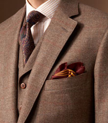
Take the checked three-piece suit at top, as an illuminating illustration on using red consistently. Though no one would say this gentleman is wearing a red outift, that colour pulls the combination together. The shirt has a red tattersall check, that’s obvious; and the red-and-gold handkerchief is also plain to see. But those pieces drag up subtler tones in the tie, suit and even buttons. All have a ruddy feel – the suit has a subtle overcheck of rust and navy, and the tie uses secondary colours linked to red (purple, orange).
The handkerchief, though by far the least subtle item, pulls it all together for me. Because without it the outift could slide into acamedic/hunting costume – lovely, yes, but not necessarily that original. The bold pop of red-and-gold handkerchief, somewhat recalling a club tie, sharpens everything behind it and demands that notice be paid.
So autumn reds and their associates, combined with originality.
The second suit is brigher and busier, yet no less subtle. Pushing together orange, gold, green, red, blue and purple is no easy task and yet it works because each is built off a secondary version of a central trio – green, orange and blue. The gold is a brigher version of orange, red a shadow to that same orange, and purple an accent and partner to blue.
To illustrate how these work in pairs, consider if the purple was used as a pocket handkerchief (or glove in the illustration). It would be lost amidst the red and green of the jacket, and struggle to be an accent to the gold sweater. As an ascot, the purple exists purely as another take on the pattern of the blue shirt. It is too subtle to be anywhere else – unlike the orange and gold, which are strong enough to hold their own surrounded by colours that are unrelated tonally.
A similar option for the pocket handkerchief would be a bright or strong green. This would accent the jacket, rather than picking up the gold as the orange gloves in the illustration do.
Last but certainly not least is the grey, green and olive combination. This is both simpler than the first example and subtler than the second. Yet it draws you in through the handkerchief’s echo of the sweater’s green in its grey tones, and the highlight that the yellow portions of the handkerchief pattern provide.
The same colours are present (and by this time I shouldn’t have to tell you that they are the colours to bring into your wardrobe this autumn) but they are minimised, focused and drawn in to the breast pocket rather than throwing the eye about.
















I admire your taste! These are three wonderful selections which seem as though they’d be very comfortable to wear on a busy day about town this time of year. Will we ever see any photos of you?
Thank you, AP. As to photos of me, have a search on the blog for The Alternative to Black Tie.
Simon
The photographs in this article are beautiful. The second in particular is exquisite; fantastic inspiration.
pretty