The cream shirt
There is a certain type of gentleman who swears by the cream shirt. Who argues passionately for its elegance over that boring, corporate alternative: white.
When I say there is a type, I am basing this on three men, all of an older generation, who have put that argument to me over the past year. It’s not a large pool to draw on, admittedly. But it is consistent.
I can see the attraction of cream. It’s the kind of subtle styling point - the kind others don’t notice until they’re close enough to catch a virus - that I normally revel in.
But most experiments with it over the years haven’t been successful. Certainly, not enough to become a regular part of the wardrobe rotation.
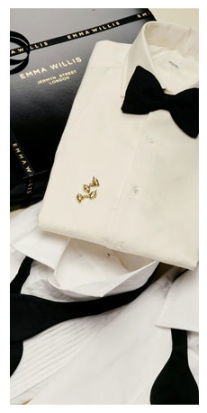
I had a silk dress shirt from Emma Willis (above), which did look nice with black tie, but never had the nice, sharp contrast of white, and wasn’t worn that often.
There was a brushed-cotton shirt from Luca Avitabile, which I have worn and liked. It was shown in this article analysing the cut of a Steven Hitchcock tweed jacket.
But while that did show how cream can complement the country colours of tweed and moleskin, the overall look didn’t appeal enough to be worn regularly.
I think it felt a little bit rural and stodgy. The kind of look, in fact, that those three chaps would have worn. With a cheap burgundy-silk handkerchief puffed in the breast pocket.
(I apologise in anticipation of offence, for these generalisations. But as we’ve discussed before, whether things ‘look good’ is heavily dependent on such personal, subjective, broad associations. They are rarely fair.)
Third time lucky.
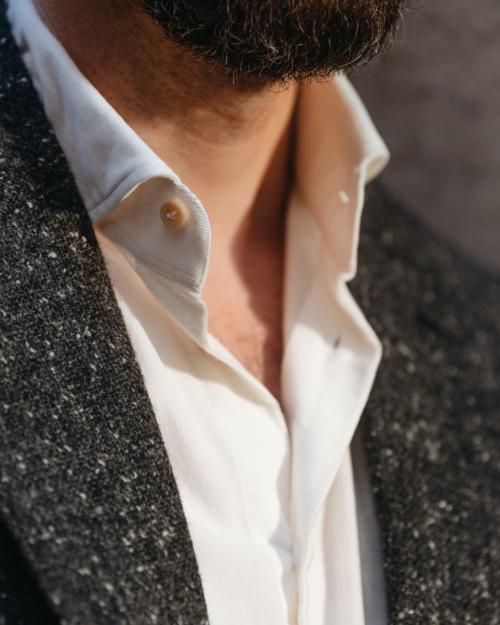
The cream shirt pictured, made by Simone Abbarchi from Thomas Mason needlecord fabric, has won a firm place in my wardrobe.
I decided to get Alex (Natt) to shoot it, back in February, when I realised I’d worn this outfit, or something very similar, almost every week for the past two months.
These things sneak up on you - they are what you grab and put on when time is short and the baby is crying - but when they have snuck, they deserve recognition.
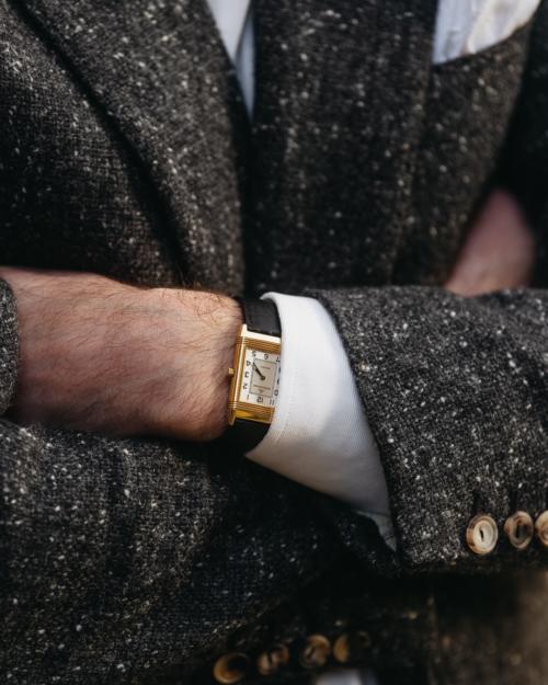
The jacket is my charcoal donegal from Steven Hitchcock, of course. And we’ve also covered before how I like that jacket with navy serge trousers (unusually).
But the cream shirt adds a rich richness to the whole which I have really enjoyed. It is smart and luxurious, but not corporate: Mayfair, not the City.
I think the texture of the corduroy has something to do with it.
Cord is, after all, a form of velvet, and there is always a little lustre in there, which the cream benefits from. Where the cream silk was very flat, and the brushed cotton more fluffy, the cord creates depth and richness, without being either shiny or showy.
The smart jacket and trousers, in their dark cold colours, also help. They suggest formality, despite the texture of the jacket and the lack of neckwear. The navy serge in particular: cream is very happy with something rich like this as a partner, and a cashmere navy jacket would work nicely too.
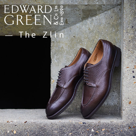
On the feet are black tassel loafers.
I’m sure there will be some who can’t tell the difference between this and a white shirt. It is a subtle difference, as mentioned, and always dependent on the light.
I think that’s one reason the white-linen handkerchief is nice - it shows that the shirt is not the same by contrasting with it. Those that can’t see the difference here might find it useful to actively compare the two.
As to needlecord shirts in general, by the way, I find they're pleasurable for their texture and warmth against the skin, but can also be a pain.
The texture of the cord makes the material stick. Only jackets with full linings are really practical, and even then they don’t slide on and off easily.
That rules out lots of casual jackets that aren’t lined, and all knitwear.
So not practical in many respects, but still a nice alternative. I have another in black which makes that colour easier to wear too.
The watch is my JLC Reverso, in yellow gold, with a new black alligator strap. It was made to measure for me (I need it, I have tiny wrists) by Jean Rousseau in London.
They have a good, reliable service, and have made three for me now.
Photography: Alex Natt @adnatt















“Mayfair not the City”
Simon I am afraid to say this type of writing comes off as naff, and perhaps a little pompous. Apologies for the rudeness but it has struck a cord.
I quite like a cream oxford.
No worries. Interested to hear why you think so though – I’m not demeaning people from either Mayfair or the City, just saying that certain types of dressing would be more at home in one than the other (having worked in both)
I don’t personally take exception to the comment but can understand how some could take it in a similar way to name dropping and in particular “names” that many (outside of London anyway) will consider very exclusive.
Having promoted their other products/done collaborations with them, have you ever had a watch strap made by Equus? Curious how you feel they compare on price/quality.
Yes I have, and they are very good. Personally it makes a difference being able to go into a store and try the different skins against the watch, which is a big reason I’ve used Rousseau
In my day (and I am merely six and twenty), the word “exclusive” meant a desireable feature of being addressed to a few that can afford and appreciate it. Now apparently it became a derrogatory term for something that people enjoy to take offence at. For me, and for most reasonable readers Simon’s comparison was very clear and accurate, representing a certain set of associations well-rooted in the British culture.
Correct. Actually there s only one meaning for exclusive. It is latin: “ex clausum”, means “locked out”. So, not for anyone. Taking offence at it clearly shows frustration for not being “in-cluded”
I loved Adrian Gill’s writing, particularly on the subject of menswear. Not sure why, but a passage on white shirts always stayed with me. He wrote, “you need a white shirt – not expensive, not fancy, just ironed. A white shirt is the ultimate result dress, the most seductive thing a man can wear. It’s our equivalent of high heels and stockings. Every message a white shirt gives out is positive. It’s unflashy but romantic.” With this in mind, I’m just not sure I could bring myself to buy or wear cream. It’d be an opportunity missed.
On the contrary I thought that phrase illustrated the difference perfectly.
I think cream is interesting in that it is, like blue, something which comes in a wide variety of shades, going towards brown at one end of the spectrum, and yellow at the other.
You can therefore match it easily to blues, browns, greys and, at a push, greens.
I do agree that it was far more commonly seen a few years ago, often with military/club ties with blazer/odd jacket/cavalry twill etc, where a white shirt would just have been too formal. I also think ivory silk makes a nice dress shirt.
By the way, why did you refer to a “cheap” burgundy silk square?
Nice point. I do think it’s a particular shade of cream I like more, perhaps more towards the yellow end of that spectrum.
On the silk square, I just unerringly find that they are cheap. Poor quality silks with machine-sewn edges.
I just bought my first non-white square, a burgundy silk/ wool from one of the budget Jermyn st. shirtmakers, before you put up the article about not wearing a pocket square much anymore….and now this!
It’s just me coming late to trends, but I’m glad I’m not paranoid…
😄
I agree that it can be hit and miss, but I’ve found that I wear my cream shirt beautifully with tan, khaki or olive chinos – the warmth of the cream works well with the muted shades of the chinos. Also makes it look much more intentional rather than the corporate casual Friday uniform of chinos and button down. Underrated shirt colour (once you’ve found the right shirt), however only worth grabbing after you’ve got the staples/classics. Good job not giving up on finding one! Haha
I really like how the warm cream colour complements the gold watch; although given the colour and texture of the shirt, I think it would look best when worn without any sport coat or blazer on top, simply matched with an interesting pair of pleated trousers, perhaps in a mid to dark grey.
I do think that it depends a lot on a person’s complexion. Cream will suit some people. White will suit others. Cream on someone who should be wearing white looks stodgy and flat. White on someone who should be wearing cream makes their face look stodgy and flat.
Which complexions do you think suit either? Does cream look better on someone with high contrast?
I don’t think it is a question of contrast actually. I think it is a question of the colour tone of the face. Those with a slightly ruddier complexion (high or low contrast) do better with white. Those with a more sallow complexion (high or low contrast), with cream. Alan Flusser makes this fourfold division in “Dressing the man”. But I first came across it many years ago when I went to a “Colour me beautiful” consultation – originally designed for women, obviously, with a name like that, but equally applicable to men if they can get past the name. They used different terminology: “summer” = ruddier, low contrast; “autumn” = more sallow, low contrast; “winter” = ruddier, high contrast; “spring” = more allow, high contrast. I have found this enormously helpful in guiding my choice of colours ever since. Many people fall clearly within one of these categories, others are more borderline. To get back to the question, I think white suits summers and winters; cream suits springs and (especially) autumns.
Thanks Andrew.
I always found it a little unhelpful that Flusser seems to mix up the points about the skin itself and the contrast.
On the colour consultation format, it’s something I’ve gone through myself as well – a family member worked for one of the companies that do it. Personally, I didn’t find it that helpful. It seems more suited to people that wear large blocks of colour, and when those colours are quite strong. Which is normally women. Wearing a dress in a single strong colour is much less forgiving than a man wearing a shirt (in probably a more muted one).
Again personally, I’ve also found that such guidance tends to focus too much on a single colour and garment. It makes just as big a difference what that shirt is worn with – a navy jacket vs a mid-grey make a huge difference to the contrast and the effect. But those pieces of analysis just look at single colours.
I won’t go into it more though – we already discussed this at length on this post on skin complexion, so future discussions could always be directed there!
Clearly I’ve failed in my aim. I’ll try to resist next time.
Thanks Simon. I will resist further discussion here too!
As a first time commenter, though, I must just say that this is a fantastic blog you are running here. It has been a real education for me and I am sure many others also.
That’s so lovely to hear, thank you Andrew. And thank you for contributing to it too
I can be the fourth man of an older generation to recommend cream shirts. For me, they seem to better compliment my northern European (read pasty) complexion than white. It can be a challenge to get just the right shade much like pink. I can also recommend grey shirts although this can be even more difficult to pair than cream. I now only have three white shirts: one button-down (that’s seen better days) and two dress shirts. I certainly think many British men are put off white shirts by the association with school; the difficulty of maintaining the whiteness and their ubiquity.
Simon,
Interested on your opinion for spread collars vs button down collars when worn open at the neck? Is their a preference here, is either more formal or more casual.
I find BD collars stand up easier with a jacket, any particular tips to help a spread collar stand more proud, I find a more constructed placket helps in that regard.
Button-down collars are certainly seen as more casual. It’s the interruption of the button and buttonhole, if nothing else. In the same way a covered placket with no buttons visible would be smarter than a normal one.
Generally, I also find button-downs much easier to get to stand up when worn open-necked. The points are rooted, and therefore the collar is less likely to collapse.
A spread collar can still stand quite proud though, and it’s a combination of several factors: the height of the collar, the height it is placed on the body of the shirt, the lining of the collar (a light fusing I find is best to curve around the jacket collar) and the jacket collar itself.
The shape of the collar is also relevant, but I find people generally focus on that too much, when the other things are more subtle but often more important.
You’re certainly right that the placket is another factor, though perhaps smaller than those others listed.
For me, the effect is barely noticable. Although, it is what you are looking for in clothing, isn’t it? A nice idea for sure. Speaking of slightly unusual shirts, what are your thoughts about tan and yellow? By far I didn’t have much succes with them, yet they come up every now and then in menswear community or Apparel Arts
Both tricky colours, and not ones I have worn much. I’d say a pale yellow can be nice as an oxford shirt – worn in and not strong in colour as a result – and tan is nice in something like a vintage army shirt. But neither are easy to wear.
Mark cho wears quite a few yellow shirts and talks on Instagram about his thought process in selecting them
Good point Hugh, yes
Nice post Simon. I have to say that I too have struggled with my own cream silk evening shirt. Whilst the Prince of Wales looks effortlessly stylish in his, mine sometimes looks like a very old white shirt that has slowly ‘dulled’ with age and use! On a very cold day last year, I wore it to a meeting (it is a matt silk and has no studs, ruffles or other ‘furniture’) with a charcoal suit and grey (wool and silk) tie, but found it very warm in a modern heated office!
“Corporate” is overrated. It implies stiffness, enforced behaviour and compliance. “Rural” implies a more relaxed mindset. This is why one is more apt to see someone in a Harris Tweed blazer and Jean’s instead of a sharp corporate suit.
An interesting post, Simon. I’ve long been a fan of the cream shirt in principle, but have a long history of struggling to find the right one. They’ve either been too yellow (which doesn’t suit me at all) or simply look like an aged, poorly laundered white. I’ve now given up on ever finding a poplin one I like. I’ve had a couple of brushed cotton ones in the past that were quite good. I was really pleased, recently, to find a nice pinpoint cotton in a shade that I liked which Simone has made up into a shirt for me. It’s a nice, neutral shade without looking either yellow or grubby white and looks good with browns, greens and blues. I haven’t tried it with grey yet.
I am one of these pro-cream people.
It must be said that there are a broad range of creams from off white to English butter. My pedantic point is that what is often called “ivory” is not cream. Upon the shade, depends the use. For a Board meeting for work I would still likely wear white, or very slightly cream.
I have a silk shirt from Budd which is more ivory. Whereas I have a cream colour cotton shirt from Budd which is much more creamy, moving towards butter. I also have the Emma Willis cream silk shirt ( ouch, the price ) that you do and LOVE it. Wonderful colour and weight and texture.
My personal taste and opinion is that the right shade of cream-tinged-off-white is more distinguished than plain white. The worst sort of plain white shirt is like a Japanese salaryman or the old school notion of the IBM employee. Cream is more distinguished and less sharp.
I have a coarse American button down Oxford from in a creamy oaty off white Mercer which I love.
Won’t bore you with every shirt. 🙂
So overall, bring on the cream… it is especially wonderful with flannel ( navy or grey ) and tweed, but also with a linen/wool/silk blend summer jacket.
I love shirts in the Ivory/cream/ecru spectrum, although I agree with what has been said above, it really depends on the particular color, shade, hue and value. Done right, it has that, what I as an American say is, “old world elegance” or charm. Done wrong, it either looks to yellow (or beige or grey etc.) or too dirty. One problem is that these colors vary wildly across brands and even, oddly within the same brands.
To sum it up, I think they are hard to get right, but when they are right, they are an excellent shirt. From my experience, at least in America, it is best to start with shirt labelled “ivory” which is the most subtle of the “off whites,” and is generally consistently not to yellow or dirty across brands. Your shirt could be labelled ivory as well in my opinion, although it could just be the change from looking at it on a computer. In any event, I’m glad you are bringing up cream shirts, as they a bit out of style currently, especially for business dress, and I hope they make a comeback. Your shirt looks great by the way! I’ve never had a needle cord shirt.
Timely article for me. I’ve been toying with the idea of a light cream cotton jumper for the summer. But I can’t help but feel the colour , for a jumper, may not be very versatile. Thoughts?
Ps I’ve found the customer service at Rousseau to be shocking. Their product isn’t up to much either. A stitching on a strap they made for me came undone. They refused to class it as a fault insisting it was wear and tear. Luckily I was at home when the watch came of my wrist.
Oh dear. I’ve never had that experience but good to hear yours.
On knitwear, I actually find cream very versatile. The only thing apart from navy that goes with everything (apart from cream). The only concern some people have is it being a little unusual, or liable to get dirty easier than other colours.
Thanks for the response. I’ll have to give consideration to a cream jumper again.
Glad to see Emma’s dress shirt is made with a proper, ie turn down, collar, and not this modern day abomination of people wearing wing collars with a dinner jacket!!
Wing collars are for white tie, and made with a single, rather than double cuff.
Well, actually no wing collars were originally worn with a dinner jacket. Turn down collars came later (introduced by the Prince of Wales). Both are perfectly acceptable.
Flusser being the first place I’d point to.
But they look rubbish ha!
The heightened collar needs to be balanced with a longer tail to work
They were originally included in black tie as the outfit was merely a dressing down by changing jacket. That wing collar moved to a turn down as it was incongruous. Supper w/ HRH wouldn’t have a wing in sight!
Well, that’s obviously your opinion. I find a wing collar is nicely proportioned with the high, thrusting points of a peak-lapelled dinner. And the long leg of the high-rise trousers.
Better with that than with a double-breasted or shawl collar, for example.
I have a cream evening shirt from Budd that is a cotton/silk blend and it works very nicely. And I have a cream, very casual, button-down collared shirt that is usually worn alone. But every time I’ve tried a dress shirt in ivory or cream it ends up looking like a dingy white to my eye. Same for light grey shirts–those just look like they haven’t been laundered successfully. So I stick to white or blue, for the most part. Cream sounds so appealing and your article made me want to reconsider one, Simon, but I’m past that temptation now.
I am with the cream shirt group. Its elegance is hard to match, especially against a background of warm colours like browns, olives and reds in the ties, or maroons and dark browns in the jacket. One of the best combinations is a cream shirt with a dark red tie. If you look at strawberries placed on a bowl of French vanilla ice cream, you’ll get the idea. The latter combination also tastes good!
In my opinion, if you have a brown suit or odd jacket a cream shirt is a must.
Cream oxford with mother of pear buttons sewn on on the reverse (so yellowish) works well for me with almost anything save for smart, businesslike or festive clothes (which I hardly ever wear anyway).
Nice point on the buttons. Thanks
Hi Simon,
As I have also quite a tiny wrist I was curious what diameter your JLC watch has, from which year it is and how thin it is? It looks quite decent! Thanks!
Hey,
I can’t remember the year I’m afraid – but I just checked the case, and it’s 22mm wide, 37mm tall (including lugs) and 7mm deep.
Cheers
Simon that being the case size makes me think you must have a counterfeit watch. I am not aware of those dimensions matching anything in the Reverso family.
Do you want to check them again and report back? I should be able to help you on this, and if you have a case number/model name etc that could help.
Patrick
Perhaps my measuring wasn’t that accurate. I have had it serviced with JLC without any issues, so I doubt it’s counterfeit.
Thanks for the offer Patrick, but I’ll just ask next time I’m in there.
Oh sorry my mistake Simon.
It’s the Classic model, originally made as a unisex choice as its quite small.
Apologies!!
Patrick
Aha, cool, thanks Patrick
Will from A Suitable Wardrobe advocates avoiding white shirts during the day and favors ecru instead. I tend to agree with as a pale Northern European !
Shout out for Jean Rousseau. I’ve used them a couple of times – once for a new strap for my own Reverso. Just a simple black calf, but they made it for me with two holes – one for summer, one for winter. I love the subtlety of not having the usual strip of holes in a strap. The other was an off-the-rack impulse purchase of a bright blue strap for my vintage Rolex Date, which really suits it. I’ve found the quality to be good and they are absurdly good value and very pleasant to work with.
Hi Simon
A question on your comment that you find yourself throwing the shirt on when time is short and the baby is crying. Did you find that fatherhood changed your approach to clothing? I ask as a new dad who suddenly finds it hard to justify a purchase (practically or financially) that I previously wouldn’t have thought twice about.
Best
Hey Ben,
Good question. This is our third child, and the oldest is 12, so it’s not a new challenge for me. I’ve managed to stay fairly sartorial throughout.
But I would say it’s a reason I favour more practical materials (few fine worsteds etc) and have become better at repairing and looking after my clothes. It’s easier to justify spending like that when you know you can make the pieces last well.
My point here, by the way, was less that I throw on this shirt, and more that I put on this whole outfit. It has become a default look that I know works well and I find satisfying, and can deal with almost any situation I might have during the day – formal to casual.
As other readers have noted, it’s hard to find the right shade of cream, some call it ecru. I have one cream shirt that I really like and should have bought at least three. It works very well with brown an olive tones in particular.
Given your observation that cream works better with more casual fabrics and that it is hard to find the right shade of it, have you considered adding a cream shirt to the PS denim or PS Oxford Simon?
Interesting point Peter. I did – I looked at oxfords in both the white we have and the cream (which is actually the stripe in the striped oxford) but the white looked rather better.
Not sure about whether it would work in a denim.
I agree with Peter – a cream Oxford cloth would make me spend money (yet again). The pre-existing ones are wonderful.
Am a big fan of cream, but primarily if it’s in poplin. New & Lingwood do a nice version – decent shade, generous collar – which works really well paired with a mid or dark grey suit, burgundy tie. And pretty happy it still remains a relatively niche choice.
Hi Simon,
I recently was at Budd to get some shirts made up, and picked out cream as a useful add to the mix. Mr. Butcher advised to go for a deeper cream colour, as if too light after several washes it looks like a dirty white. I thought it sound advice.
And yes, cream for Brits has connotations, class and old school etc, but for me it just has something slightly romantic about it, especially in a smooth sea island cotton.
Thanks for keeping us all thinking.
Simon, would you say that the average man about Mayfair is well dressed? I used to work there (on Bruton Street- I have a feeling I met you once) but I don’t remember being very impressed with the clothing I saw around me.
On average, no, certainly not. But at the same time (sadly) it’s still probably one of the best-dressed places in the country.
Usually your posts are accurate and precise. But this time, I’m sorry, I find some confusion. Generations of gentlemen have used white shirts made not of cotton or linen, but of silk. Then, white silk was not exactly white, but cream-coloured.
That’s why the cream shirt is considered by some to be more elegant than the white shirt – because it resembles silk.
and using a silk shirt, or a white poplin shirt with tweeds, donegals or moleskin is a nonsense. Or you wanted to talk about pale yellow oxford, instead?
Thanks, that’s a good point about silk.
Though just because that was the derivation of the look being appealing, I don’t think that precludes it from looking appealing now in different materials, weaves or combinations.
Having had made cream sea island cotton shirts at The now extinct Coles of Sloane st in the 70s if l put one on now l feel positively ancient.
I think cream shirts have a place in one’s wardrobe, but depending on complexion they can be difficult to wear. Skin with warmer undertones, often pale creamy skin or golden tan skin, looks better in cream than white. For cooler skin tones like yours cream more often looks like a dingy white. With earth-toned clothes, a cream shirt can avoid looking dingy on cool-toned people.
I was turned on to the cream shirt after watching the colour series of The Saint. Roger Moore’s complexion looks fantastic in cream, and he wears them with every suit and sports coat. It won’t work for everyone, but on his golden tan it always looks great, never old-fashioned or dingy. A white shirt with would be fine with a blue or grey suit, but on him it would clash with a brown or tan suit. Rather than looking like a plain canvas, a white shirt would look harsh against everything else.
Simon, I hope you don’t mind me asking but II also have small wrists – what size is the Reverso you’re wearing?
Many thanks.
See comments above, Will
Hi Simon
Some of your subscribers are spot on related to the color, cream. It should be worn because of your complexion or skin color. For skin types such as what the ladies call an autumn or fall skin color, cream or off white is suppose to be the “white” for their entire wardrobe. Regular white simply washes this skin tone out. It also means that the colors worn with the cream should be warmer than the blues you were wearing. Here is your challenge. Cream and off white dress shirts are extremely difficult to find. Can you provide a list of where one can find shirts in that color. Thanks for the incredible writing and topic.
Cheers Jim.
I’m afraid I won’t be much help on the RTW shirts no, as I usually have things made. I’d try Budd, Turnbull & Asser and similar traditional makers as my first attempt though
Was rereading this (excellent) post as I’ve been looking to ingrain in myself a basic understanding of the applications of a cream shirt, and did a double take at the end: I had no idea the famous philosopher was making leather goods!
Kidding aside Simon, based on your experiences and experiments over the years what other shirting materials do you believe would work great in cream? And if there is one, is there a particular shade of cream that works with the widest range of combinations?
To be honest Joseph, as mentioned, I haven’t found it that successful for me in any other materials. I haven’t tried all of them though.
On shades, I find it hard to be precise with the differences between them. But in general, you’re safer the whiter and bluer you go – the creamier, so the yellower, the harder it is
Interesting point, thanks Simon. Adding that to my notes.
I would venture to say that cream is just more at home with other articles of dress precisely because it’s such a rich color, demanding a place in the foreground rather than the background the shirt represents.
Ah, such a joy to reflect on these things!
I’m pleased the joy is there. It should always be there. If not, stop!
Hi Simon,
do you still know the details of your new watch strap from Jean Rousseau? Material, Padding, holes, etc.?
Would be really interested in that.
Thank you!
It was small-scale alligator, single hole (though I should have had one extra, for hot weather – that’s easy to add) with standard padding
Hi Simon,
What do you think of a plain cream pocket square? I know you rarely wear any anymore but I would love to hear your thoughts. I have one but I’m having a hard time pairing it. In this post you’re wearing a cream shirt and a white pocket square, I tired a white shirt with my cream (the tone leans toward yellow) pocket square but it looked odd.
Thanks.
I think cream silk is difficult. It tends to look a little old-fashioned. Nice with black tie perhaps, but otherwise I’d avoid it.
I do wear a cream cashmere one though, which I like. See here.
It’s actually cream cotton. I had a Harvie & Hudson shirt with an irreversible coffee stain down the front so I had my tailor cut me a pocket square from the back fabric. I understand most PS readers probably wont have the same thrifty approach, but it did seem like an interesting project at that time.
Sorry I missed the post on the cream cashmere handkerchief, I did a quick look for a “cream pocket square” on the search bar before commenting, and didn’t find any. My bad, I should have been more diligent haha.
No worries. A note for us on the search function too
Thanks. Cheers!
Hi Simone,
I know It’s an older post, but I still hope you’ll answer. I will be in Florence in 3 weeks, and I wanted to try Simone and his work. I found your article on the grey shirt which you had made by him, and there were some minor complaints about shoulders and waist. My question, therefore, should you say this is a better fit than the grey one? Or how would you “compare” those two. I wonder if He’s getting better or not.
Thanks,
Denis
I wouldn’t say he’s getting better necessarily. In fact, it’s hard for a customer to know why shirts are better really. But it’s most likely to be the fact that a shirtmaker gets to know a customer over time, and the fit improves as a result.
Little points of communication get better understood as products are made, and you learn more what you like too.
Hi Simon, what do you think of a shirt made of cream-ticking stripe oxford cotton? Would you say it can be a versatile piece as a blue stripe?
Many thanks,
Jack
No, not as versatile, but might still be nice
Love a cream shirt, moreso an off-white/ivory shirt with just a hint of yellowing, I’ve heard the terms used interchangeably. Great for when I’m not sure if I want a white or blue shirt. People say cream shirts work better on warm complexions but I have a fair complexion (not sure if it is winter or summer) and I got a compliment wearing a off white shirt saying it worked nicely for my complexion.